Designing a scalable internal management tool
Focusing on usability and scalability, we built a tool to manage our global network of discounts and community of members.
Company
Student Beans
Role
Lead Product Designer
Two years ago we kicked off the huge undertaking of designing and building our own content management system. It’s now giving life to our consumer products, easily scaling alongside them and making the day to day tasks more enjoyable for the Ops team.
The Problem
Over the years, little consideration was given to upholding the internal content management tools. The tools that were used to manage the companies global network of discounts and community of members were riddled with bugs. The usability and stability of the system had gotten so poor that it was hindering the growth of the company and increasing the stress on the Operations Team.
Every second they waste trying to find the right information or perform an action because of poor usability, is money the business loses. An easy to use product means they’re more productive, and companies need to invest less time, money and effort in training and mentoring. As the company continued to grow, with teams split across the globe, the cost of ignoring this problem was also growing.
Design Goals
My role as a Product Designer in this project was to hit two main objectives:
- 1. 🚀 Create a new content management tool to allow our global Operations team to efficiently manage all content
- 2. 🛠 Design for consistency and scale by using reusable components to simplify changes, reducing design and technical debt
Discovery
We spend our days improving the consumer facing products, carrying out user studies, prototyping, constantly iterating and collecting data all to improve the experience for our users. It was time to use the exact same methods to improve the efficiency of the backend business.
The aim of discovery is to understand our users, how the problems effect them, and to start to understand the viability and feasibility of any solutions for the business
To successfully do this I needed to create an environment for collaboration of a cross functional team. Some of the methods I used though the discovery and define phase to understand the business needs, analyse user behaviour and understanding the technical constraints were;
- 🗣 Open and frequent communication — Organising a cross functional team, including stakeholders from across the business, early on and creating methods to allow for unristricted and frequent communication helped to build a great relationship between team members. A dedicated slack channel allowed for progress to be shared publically.
- 👀 Primary Observations — Key to uncovering the real problems! I interacted with the Ops team whenever possible. I even spent a week in London sitting with them to study how they used the current system; did team members carry out tasks differently to each other? what were their pain points? what already worked well for them? where did the tool have to be ‘hacked’? what was the most time consuming task? How much real estate do they give to the CMS... and lots more.
- 🤓 Expert Interviews - I needed to understand everything the current system provided for the business, the overarching objectives and the desired outcomes. This meant questioning why data points needed to exist and if there were ways we could be doing things better.
- 👨🎨Working in the open — Just as progress was shared in our open Slack channel, I made sure all working documents were open for others to consume. Opportunities were always given for feedback and collaboration. Establishing an open way of working early on allowed me to continue involving the ops team and key stakeholders as I progressed the designs, with little friction.
- 🤖Sitting with Engineering — We encourage a close relationship with design and engineering and make sure that projects are kicked off in tandem. It's important that Engineers have the context and the opportunity to contribute. I could discuss initial ideas and get feedback on technical feasibility before moving any concepts too far forward.
Discovery Output
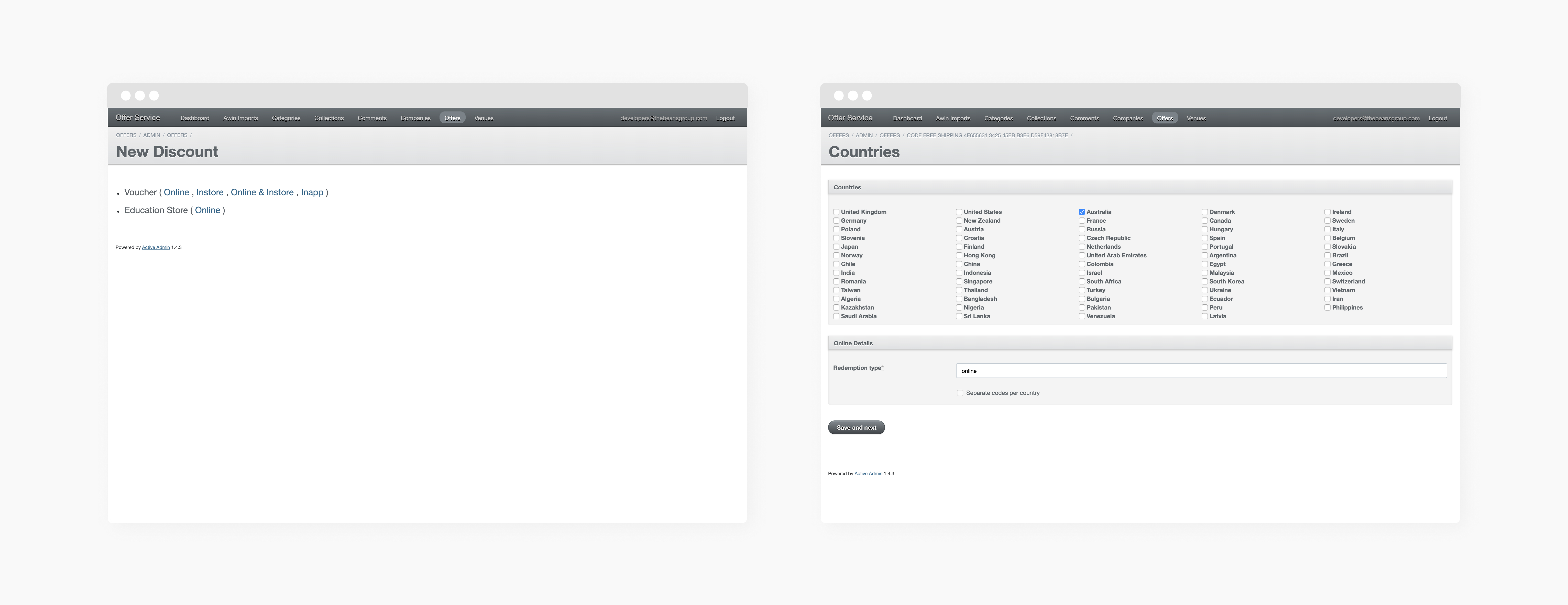
Discovery made it very clear to everyone that the whole system had to be reimagined and rebuilt from the ground up. I was initially optimistic, thinking we would stumble on just making many but small changes to the current 3rd party system to improve it, but the usability, performance and stability was worse than I or anyone could have imagined!
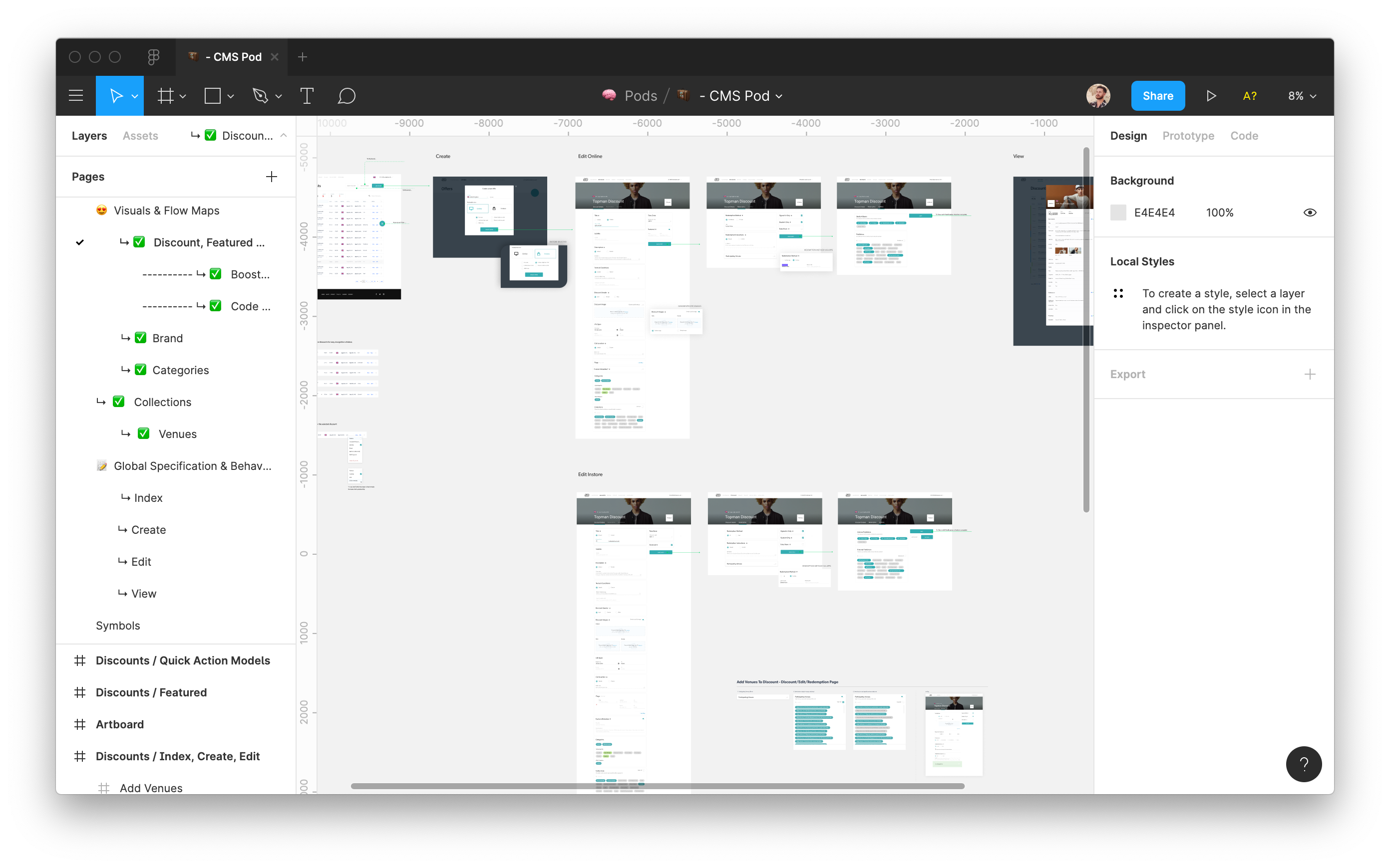
My approach to understanding the requirements of the system for the business, as well as getting a deeper understanding of our Operations teams ways of working, I was able to identify opprtunities to create a consistent management pattern for all our content. There would always be 4 main areas/stages to managing and creating objects in specific models:
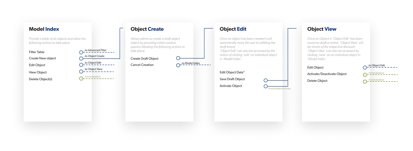
- 1. Model Index — An area that would provide an overview of all objects related to the specific model.
- 2. Object Create — A way to create a new object within the model
- 3. Object Edit — A way to add/edit all dependancies for an object
- 4. Object View — A way of viewing an object and all its dependancies
Identifying and defining consistent elements, approaches and themes meant we could create reusable components rather than one-off solutions.
I built out a breadboard of the agreed IA. This map included all the data points that would need to be available from each page and visualised the high level user flows — Showing us all the possible states, user’s inputs and goals.
This provided an agreement between Product, Design, Operations & Engineering. I was able to reference this as I refined the design direction.
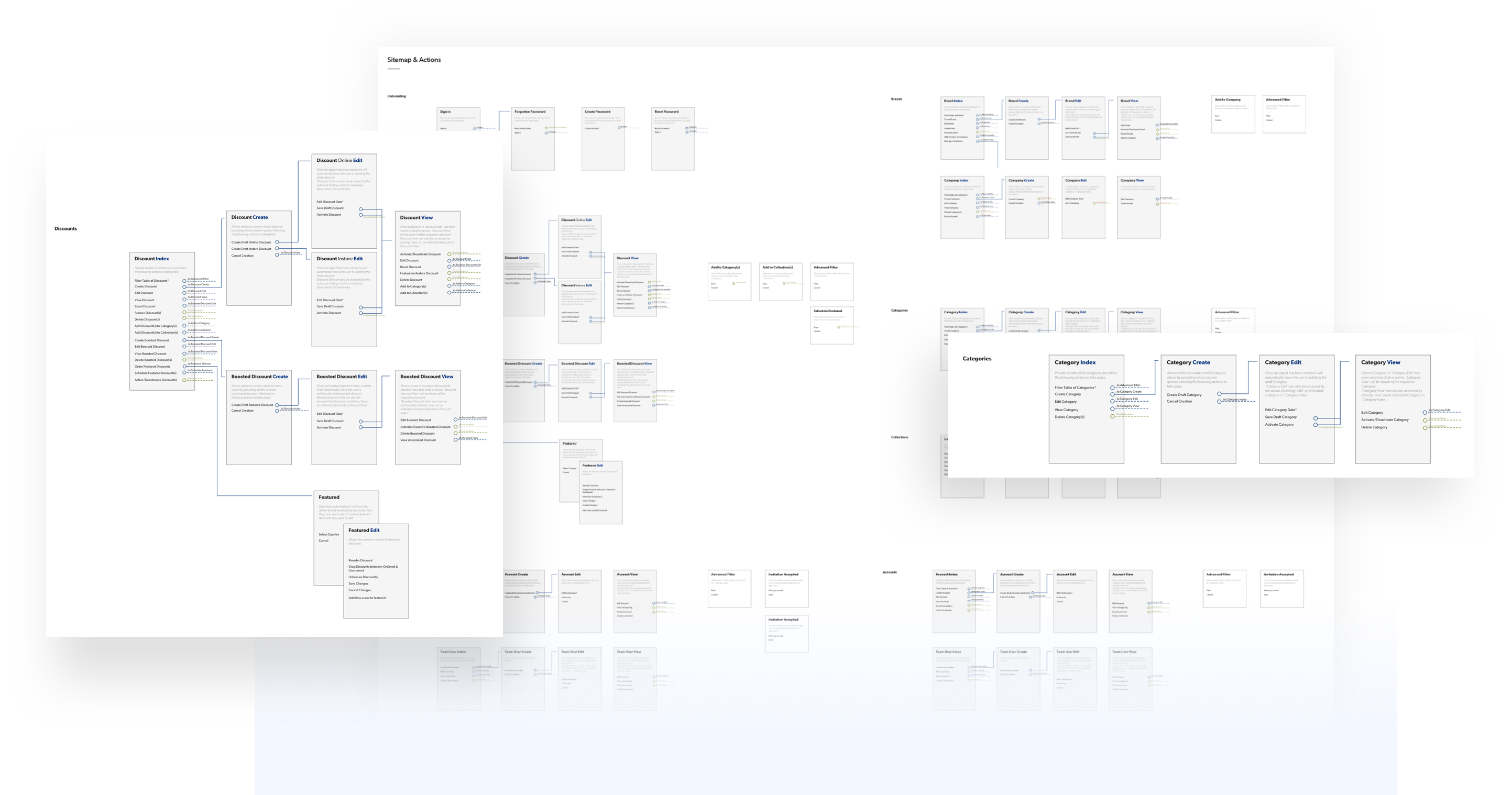
There are around 12 top level models that need to be handled by the content tool (discounts, categories, brands, collections to name a few…) that can have unlimited objects created inside of them, all of which are closely interlinked, can be managed independently, and across 15 countries & languages 😳
Validating design decisions
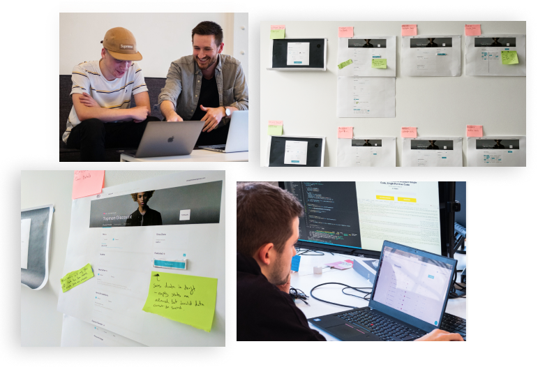
Throughout the design process, my primary goal was to learn from the existing usability issues in the current CMS and be proactive in testing new flows and solutions with others as soon as possible. I shared solutions and design directions early and often with the Operations team.
Creating simple click through prototypes allowed us to receive rapid feedback from multiple stakeholders. Using the top twenty tasks identified from the initial research, I conducted holistic tests of the UI. Users of different experience levels completed isomorphic sets of tasks, to measure ease of learning and ease of use once learned.
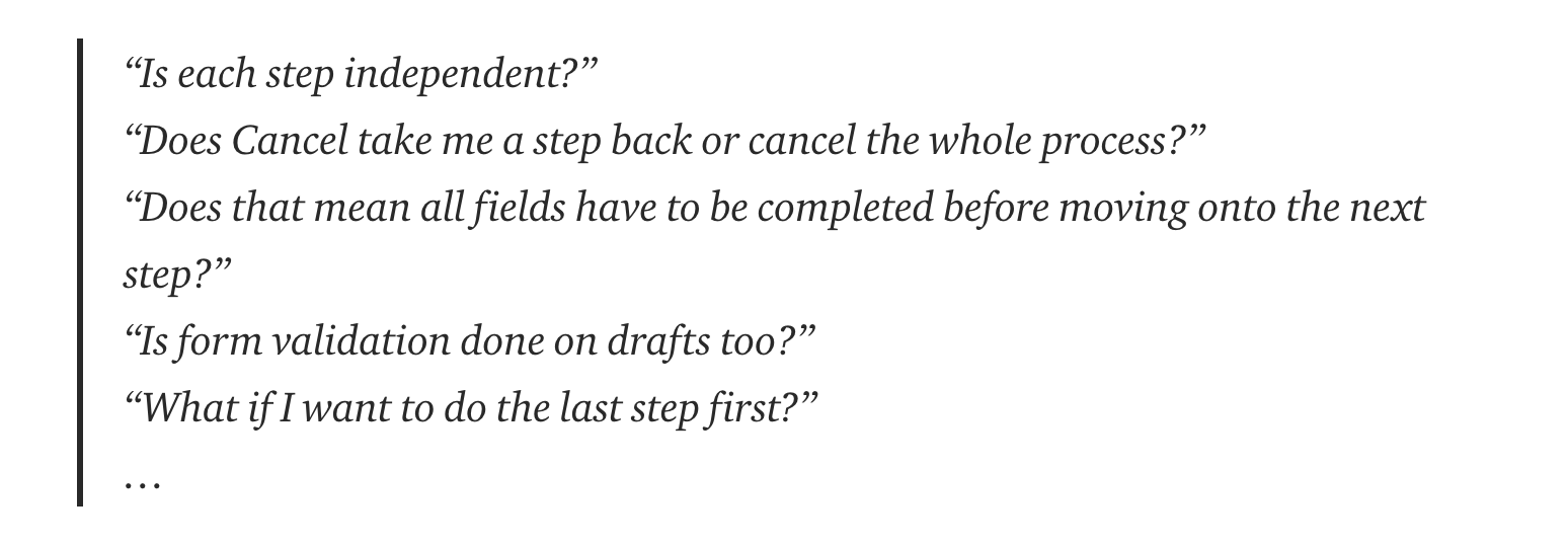
After each round of testing, annotations were added to printouts to easily collate what had been learned. In this particular example I found that there were different expectations for what would happen when you tapped the next button on the multi-step edit flow.
Identifying any potential flaws in the UI or UX prior to the build are invaluable. I was able to address these issues in the cheapest phase of product development.
Build Approach
Due to our eagerness to create reusable components and build the CMS based on existing building blocks, we ended up building the system in completely the wrong way. We began building the Index page for every manageable model in an attempt to build everything that looked the same together and then move on. 6 months into the project, as we were burning out and didn't have a single part of the system usable, we realised the approach was off.
Reforming the team, and now with the help of a Delivery Manager, we realised we could potentially provide value by splitting the system into complete end-to-end verticals. The down side would be that the Ops team would have to use two CMS's as we slowly transitioned. However, with some careful consideration we realised there were parts of the CMS that were infrequently edited. We decided to focus on the every day tasks of the ops team. This would be the management of Discounts as the priority.
We introduced Stories into development and focused on completing user tasks. A completely obvious approach in retrospect!
🚀 Improving efficiency by design
Design Goal 1: Create a new content management tool to allow our global Operations team to efficiently manage all content
The main aim of this project was to create a new content management tool to empower our global Operations team to efficiently manage our content.
The CMS allows admin to manage over 12 different objects, for the purpose of this case study I will show how we improved the management of Discounts specifically as this is the most demanding use case.
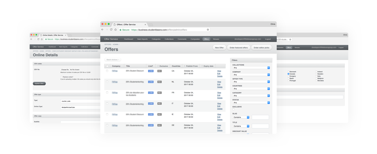
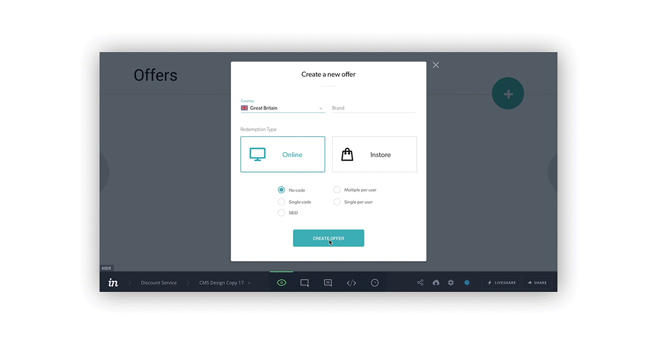
1. Creating and editing discounts
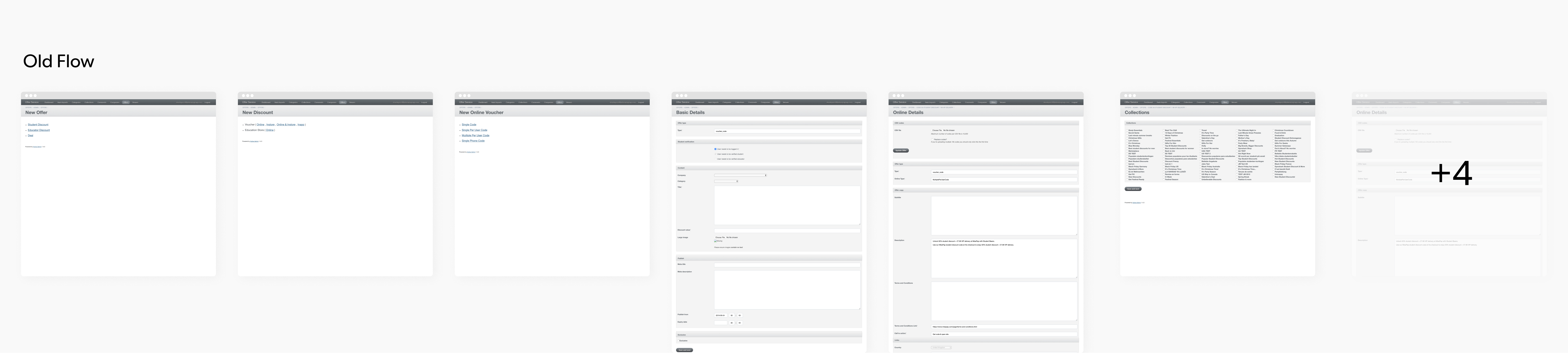
The creation of a discount created the most headaches for our Operations Team. The major issues lay in the complete lack of attention to the information architecture. To list a few;
- The 11 step-by-step wizard type flow only had two or three options per step that were unrelated to each other. Removing all benefits to a wizard type form.
- Lack of descriptive field labels, descriptions or helpers. Making it incredibly hard to use for anyone that wasn’t a veteran.
- Unable to easily differentiate between online and in-store offers. To edit an In-store offer you had to edit the Online offer first.
- Default copy was not shown to the user. You were expected to just leave the field blank if you didn’t want to override copy, but this wasn’t communicated clearly
The new and improved
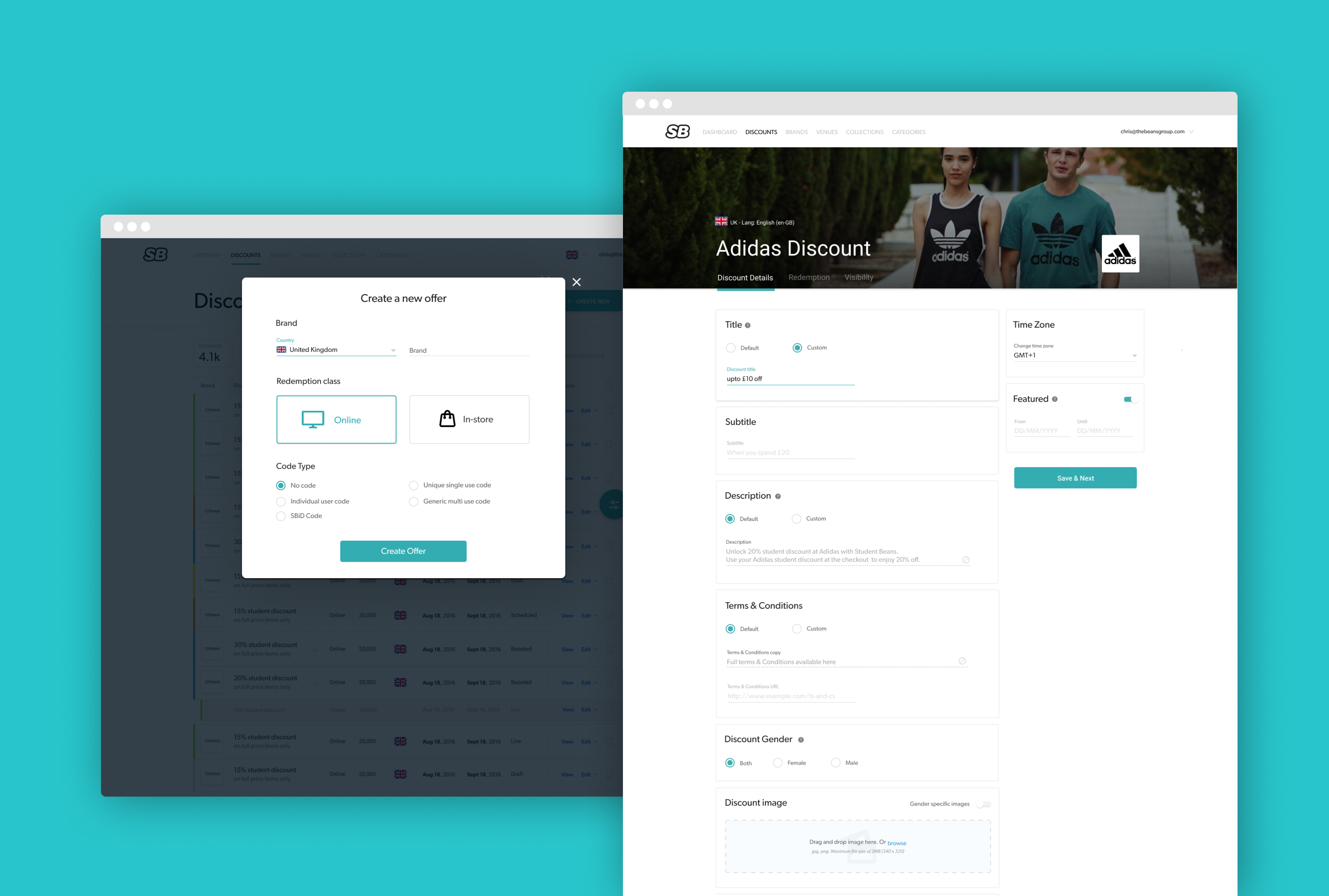
The new way to create discounts effeciently.
How is it better though, mate?
- A more logical step by step process that groups forms together. The groups having more editable sections favours being able to add content in a sequence the user wants to.
- Form blocks have clearer titles and it’s more obvious why fields are grouped together. Descriptions are used to provide more instructions and there are optional helpers to add further details. Both help onboard new users quicker.
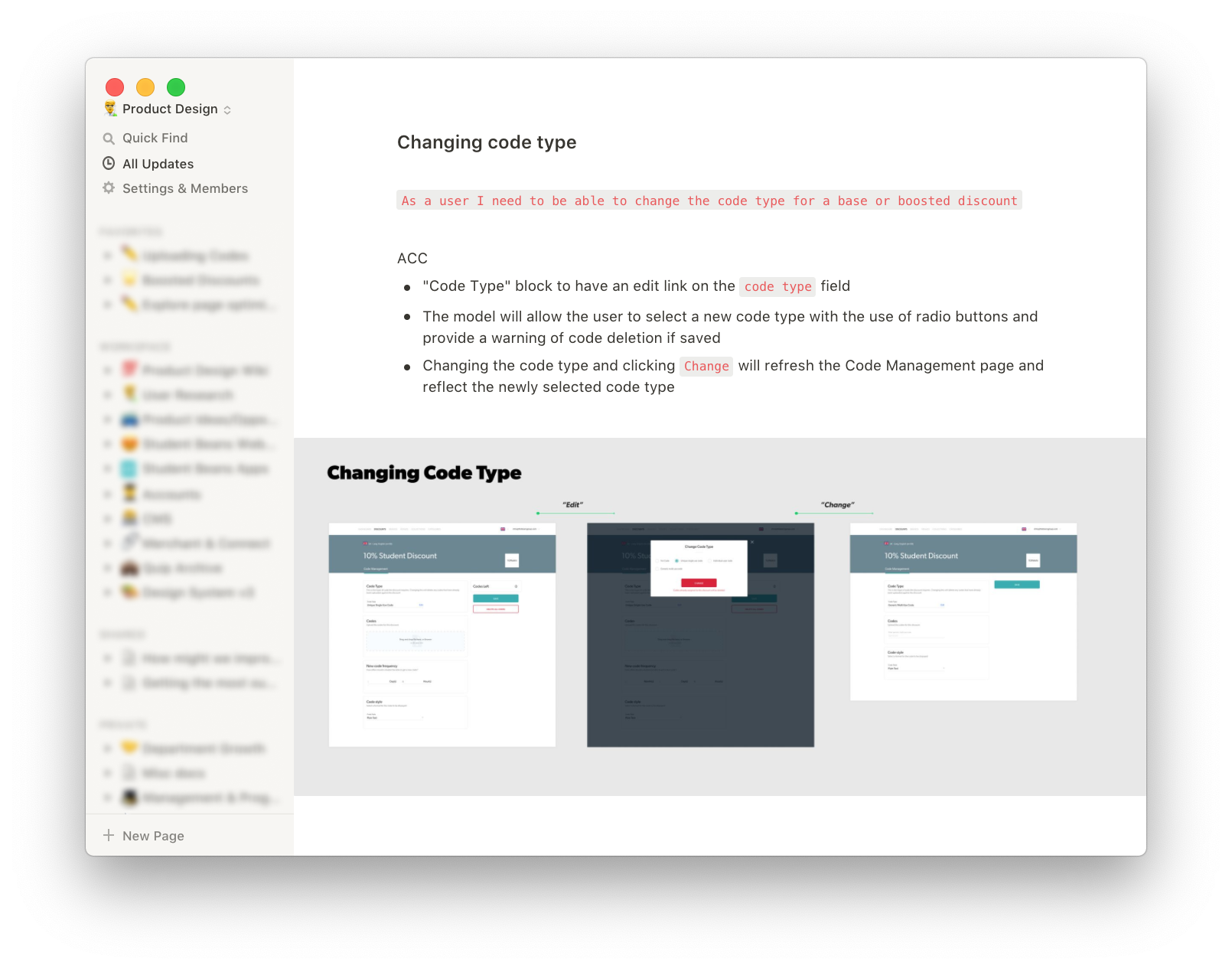
- The fundementals of a discount are now asked up front. The brand, whether it's Online or In-store and the code type. These are the core elements to defining a discount, which allows it to be much easily identified while in its draft status.
- Any default copy is now dispayed. The user can clearly see what it will be and if they want to override it.
- I've created better visual cues to help users identify which brand and country they are working with. Helping reduce human error.
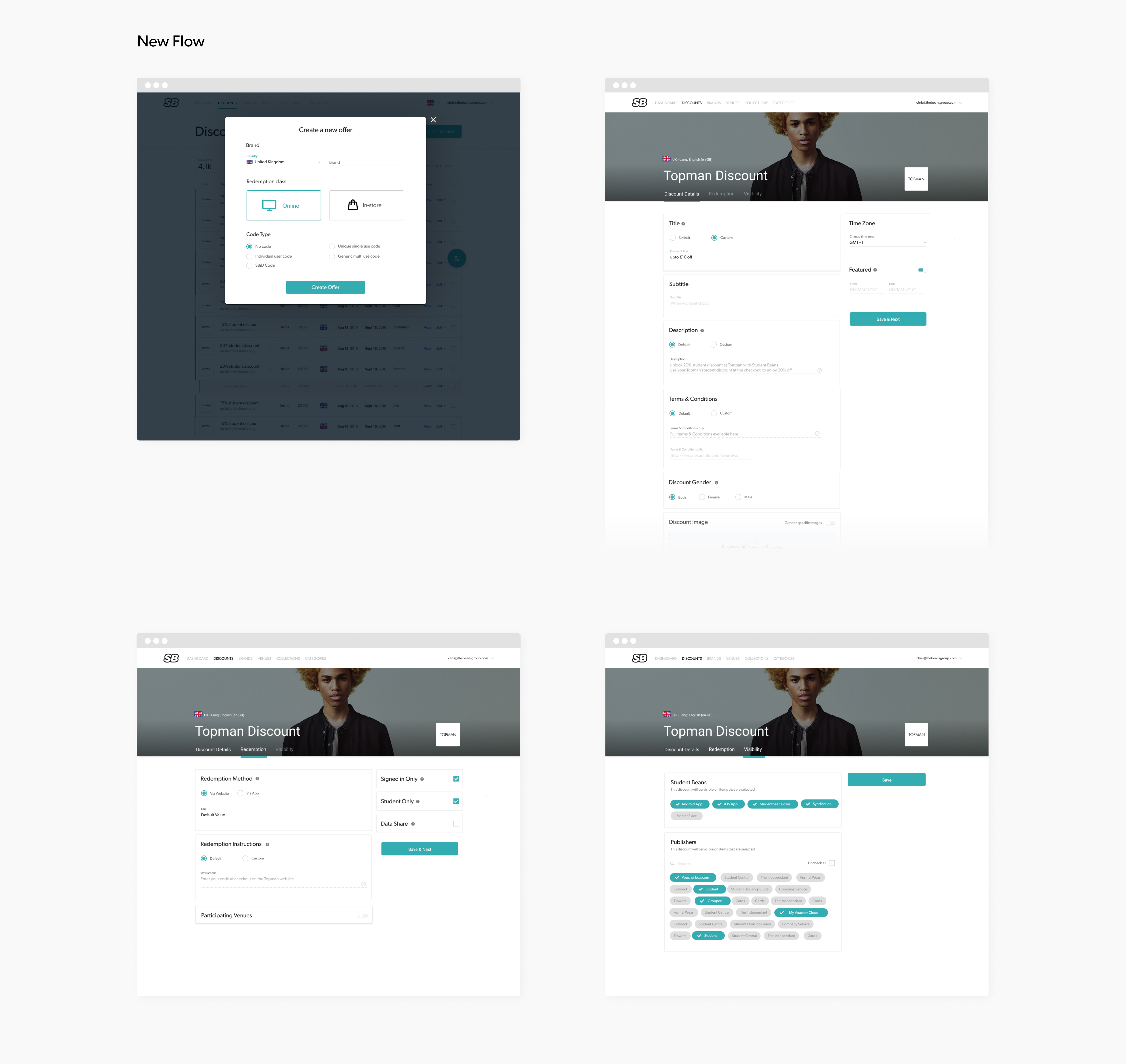
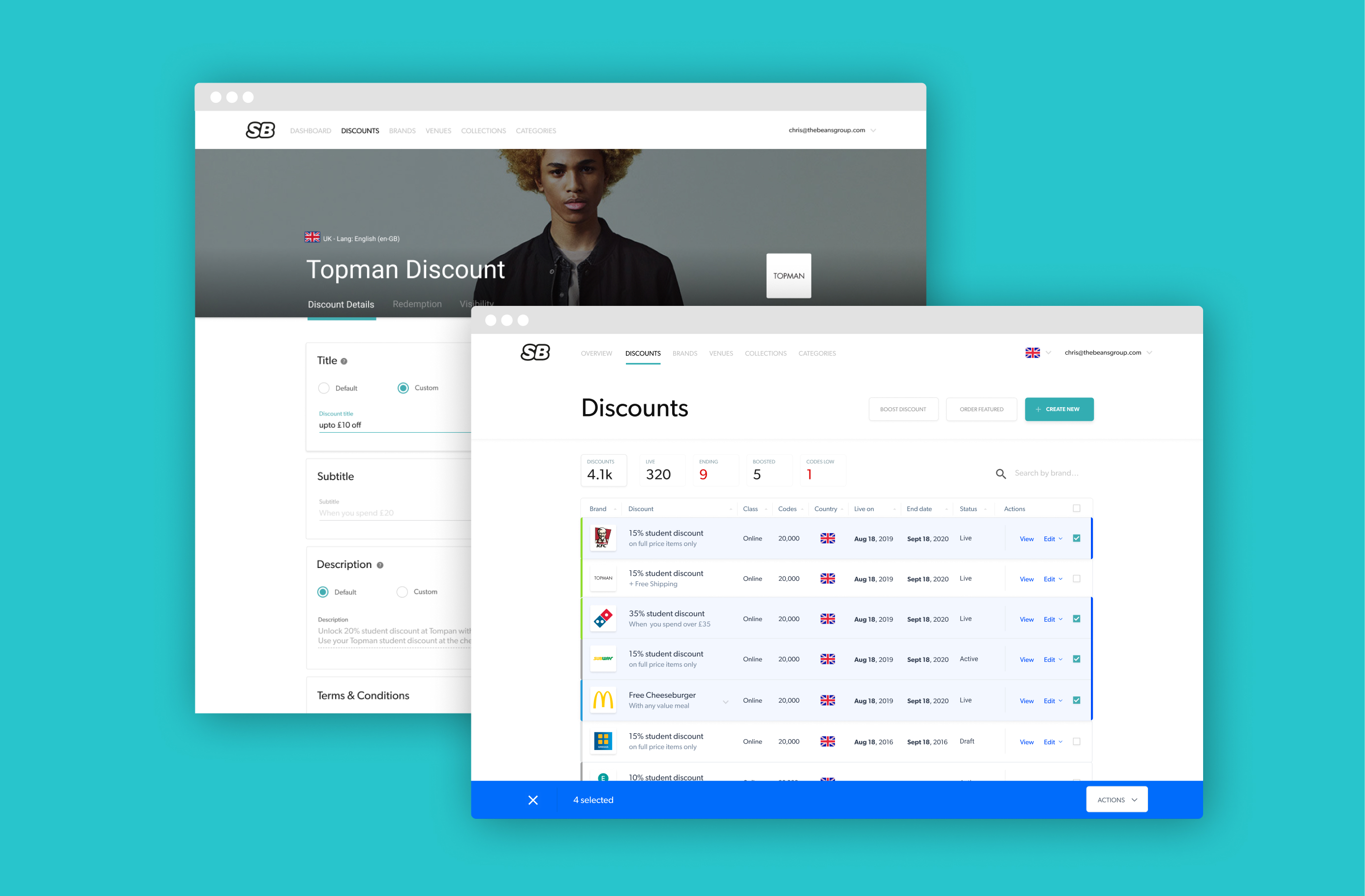
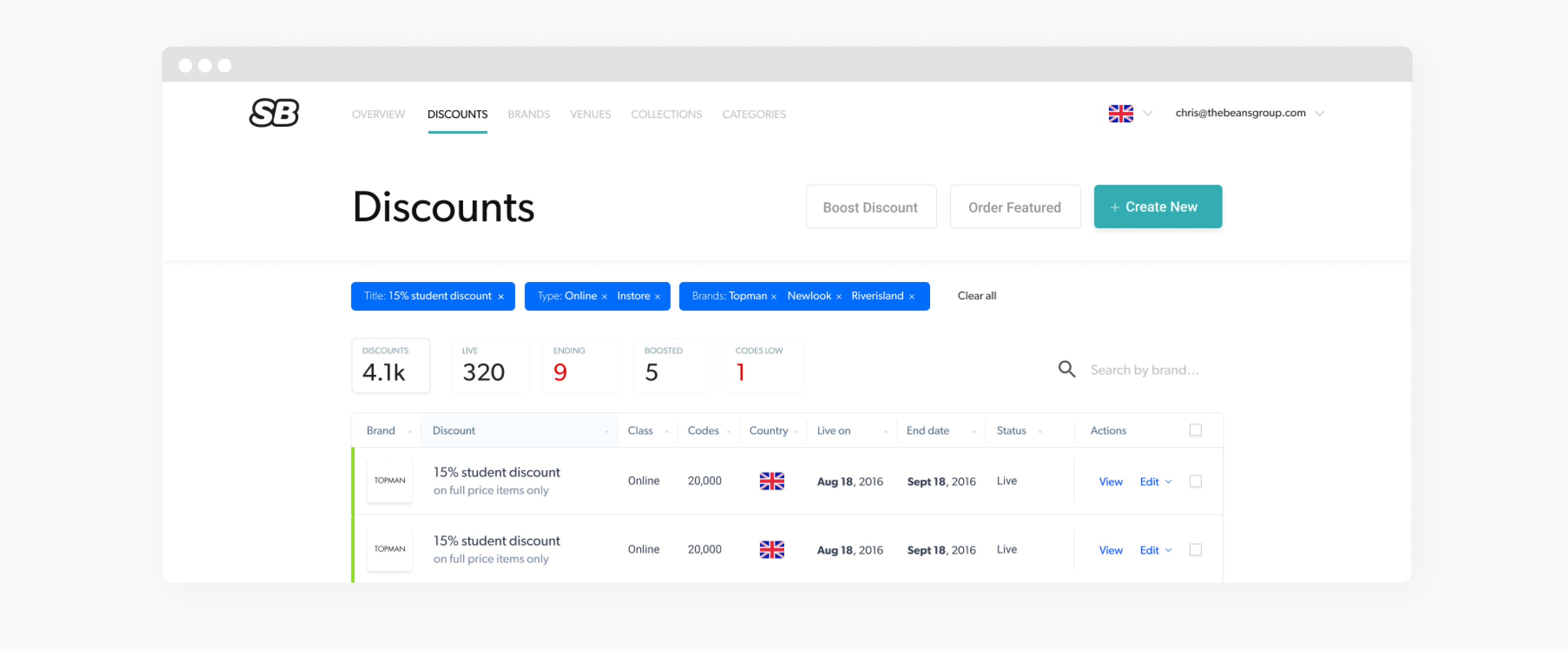
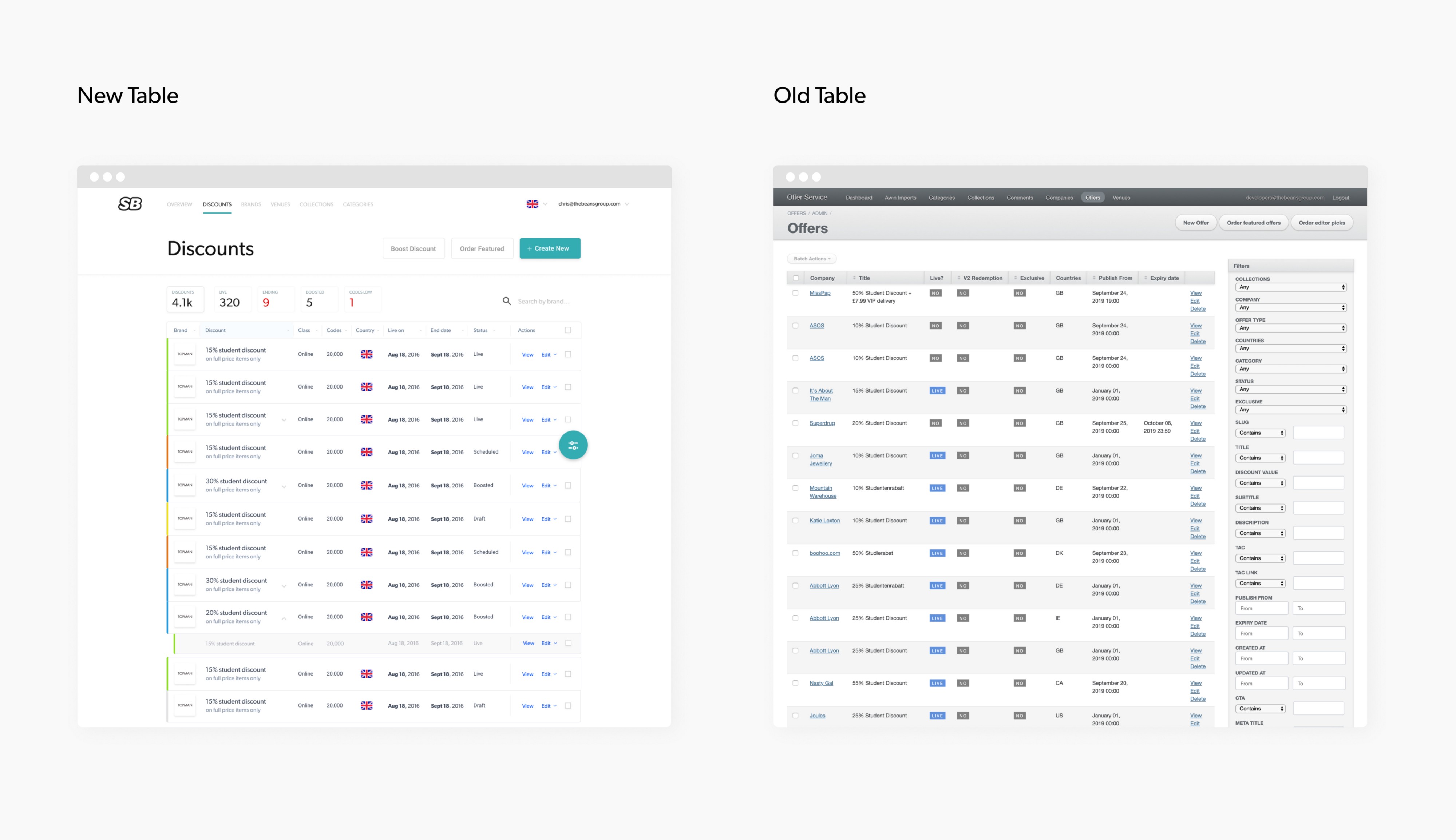
2. Improving discoverability
Another issue theme with the current CMS was being able to find content in the abyss, and being able to easily identify types of content.
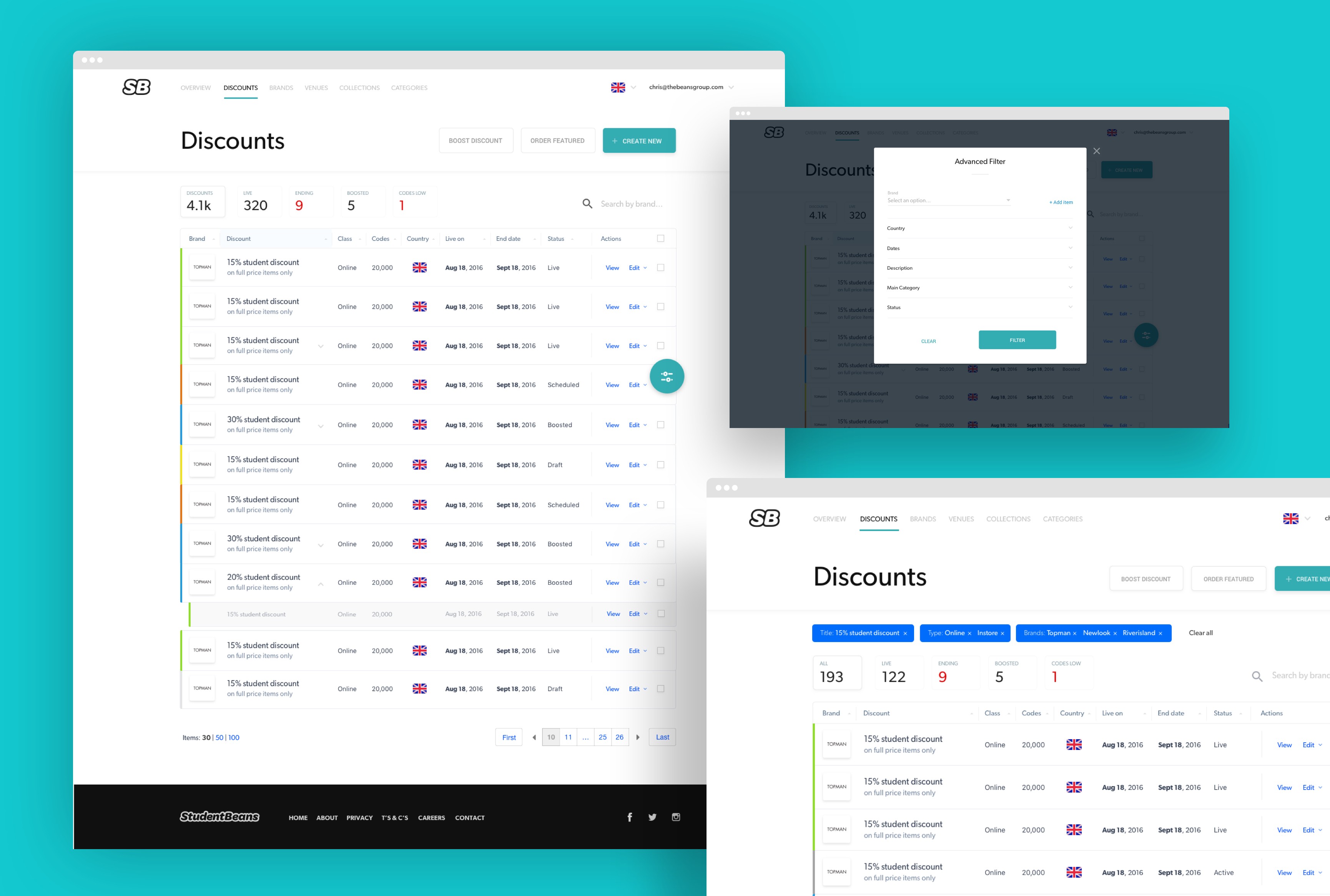
To improve the way that the Operations Team find existing content, the following features were added:
- "Glances" were added above the table to provide an overview of the content. Providing insight into the number of discounts that are live. The most useful being the "low codes" notification.
- The country of every page of the cms can be selected at the highest level to allow Ops to move around and only have to filter once.
- A colour code for the status of the discount (live, draft, boost and ended) was added to help provide a quicker way of identifying live discounts. Logos and flags were also added to help improve scannability
- An "Advanced Filter" was designed to allow the user to deep dive and conduct granular filtering. In the old CMS it wasn't always clear if filters were present, so visibility has been improved and a way to easily tweak has also been introduced
- A free form quick search has been introduced for less granular filtering needs
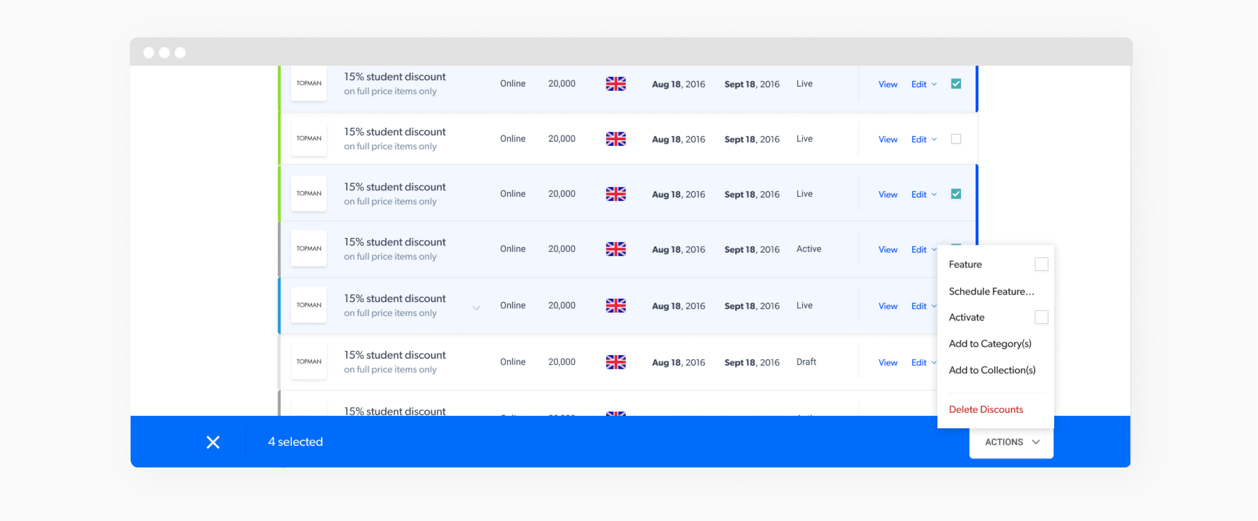
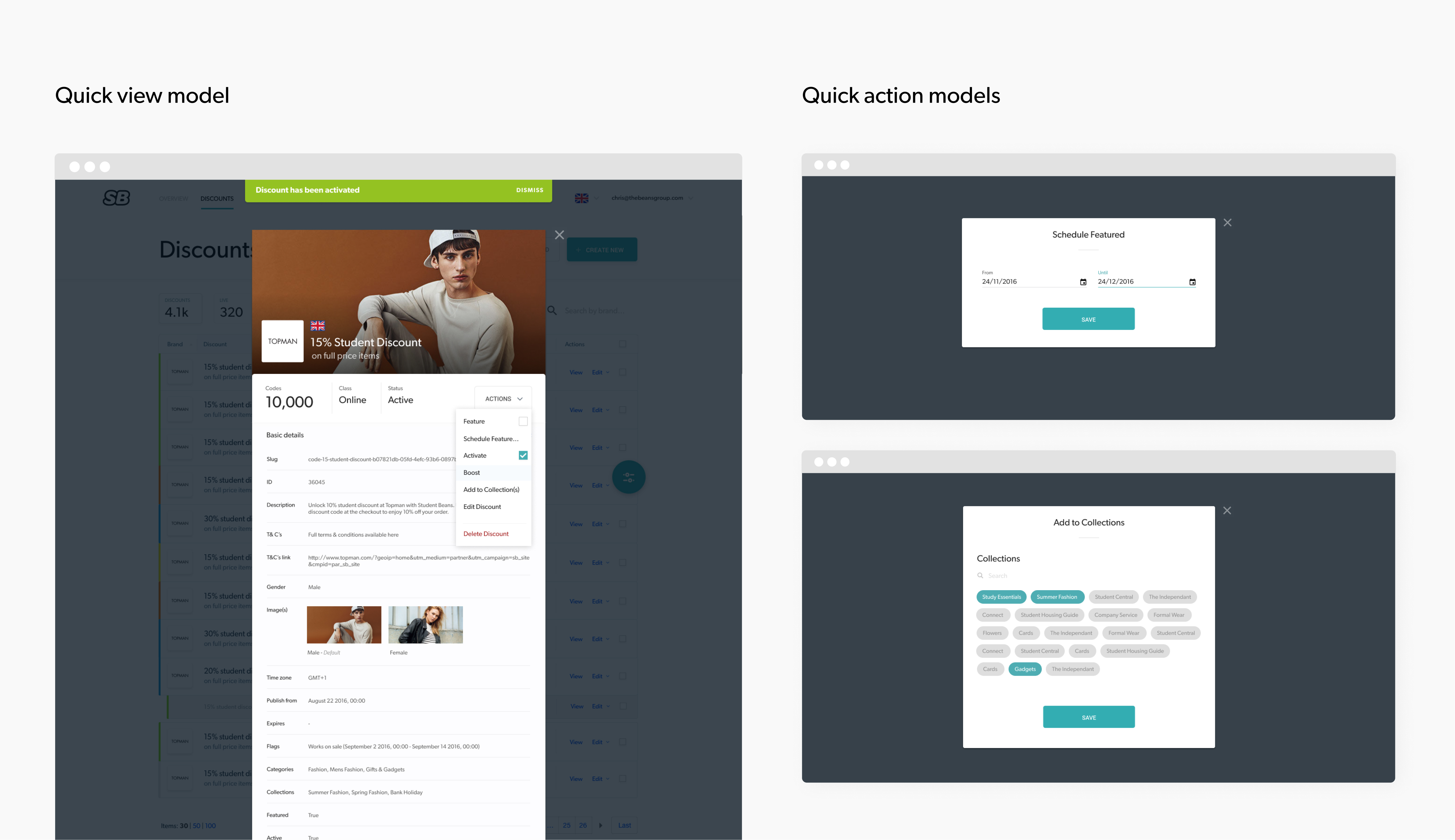
3. Speed of managing existing content
The third issue theme related to the managmenet of existing content. There were a few tedious actions with the current CMS that could be addressed to save the Ops team valuable time
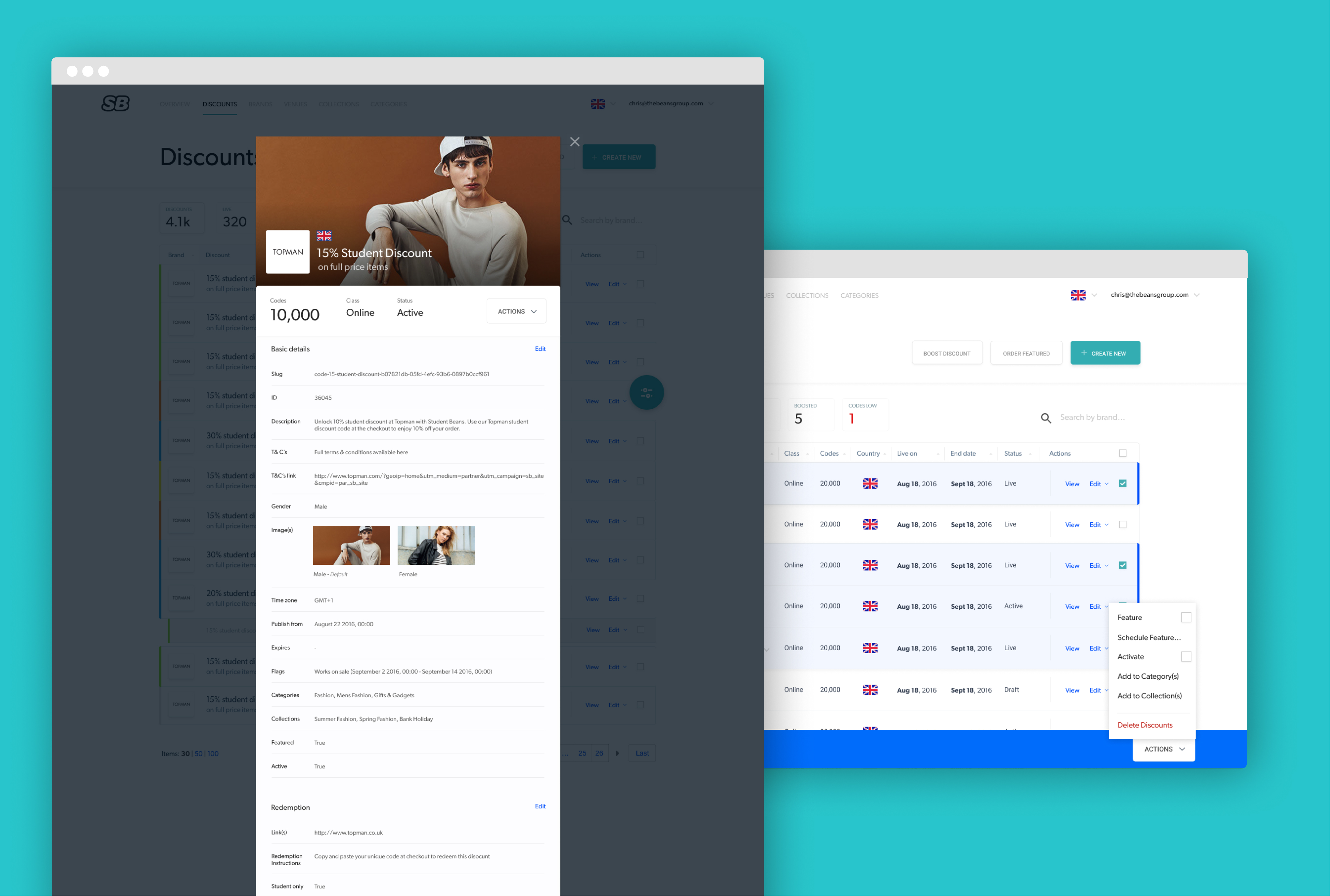
To improve the way that the Operations Team edit existing content, the following features were added:
- We allowed for multiselect and bulk actions - meaning that changes could be made to a number of discounts in one go
- Clearer notifications were introduced to provide better feedback to the user that actions had been completed successfully or unsuccessfully
- Quick actions were added so that you could make changes to frequently edited options without having to go into the complete discount editing process
- A view model for the object allows you to see the complete makeup of a discount in one view
- From a view model, you can navigate straight to a relevent editable section
🛠 Improving technical efficiency
Design goal 2: Design for consistency and scale by using reusable components to simplify changes, reducing design and technical debt
We wanted to be sure to create a platform that other people could use, build upon, and extend internally. Building an entirely new product and a design system at the same time was a challenge.
As the UI began to evolve and define itself, I would pull components out into a separate Figma file. We developed standards across a number of elements from foundational parts to common components. Over time this created an extensive suite of patterns, components, templates, as well as specifications and usage examples for each — Becoming the master design system.
Development first began with a focus on these core elements of the CMS which set the foundation to build specific featured on top of.
The system’s promise is enabling a consistent experience spread across products and sustained with a dependable, predictable practice.
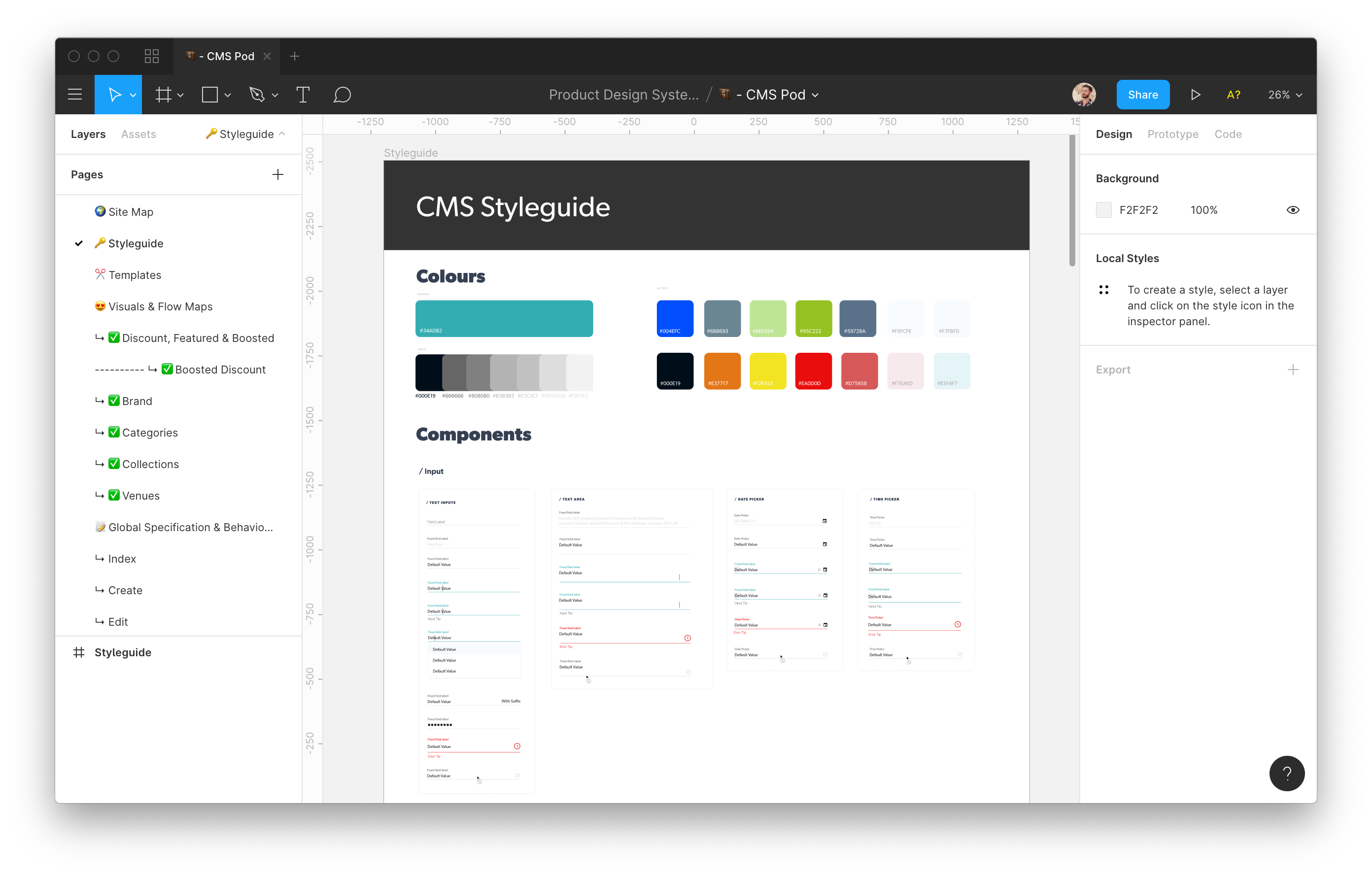
Templates & Components
The Design System (CMS POD) contains all the individual elements and components that make up the whole product. This is the single place to come to to grab the building blocks to adding any new features to any of the products that use this design system. The aim is to be able to use any of these components to build anything new, only if these are unable to satisfy the brief can new components be introduced.
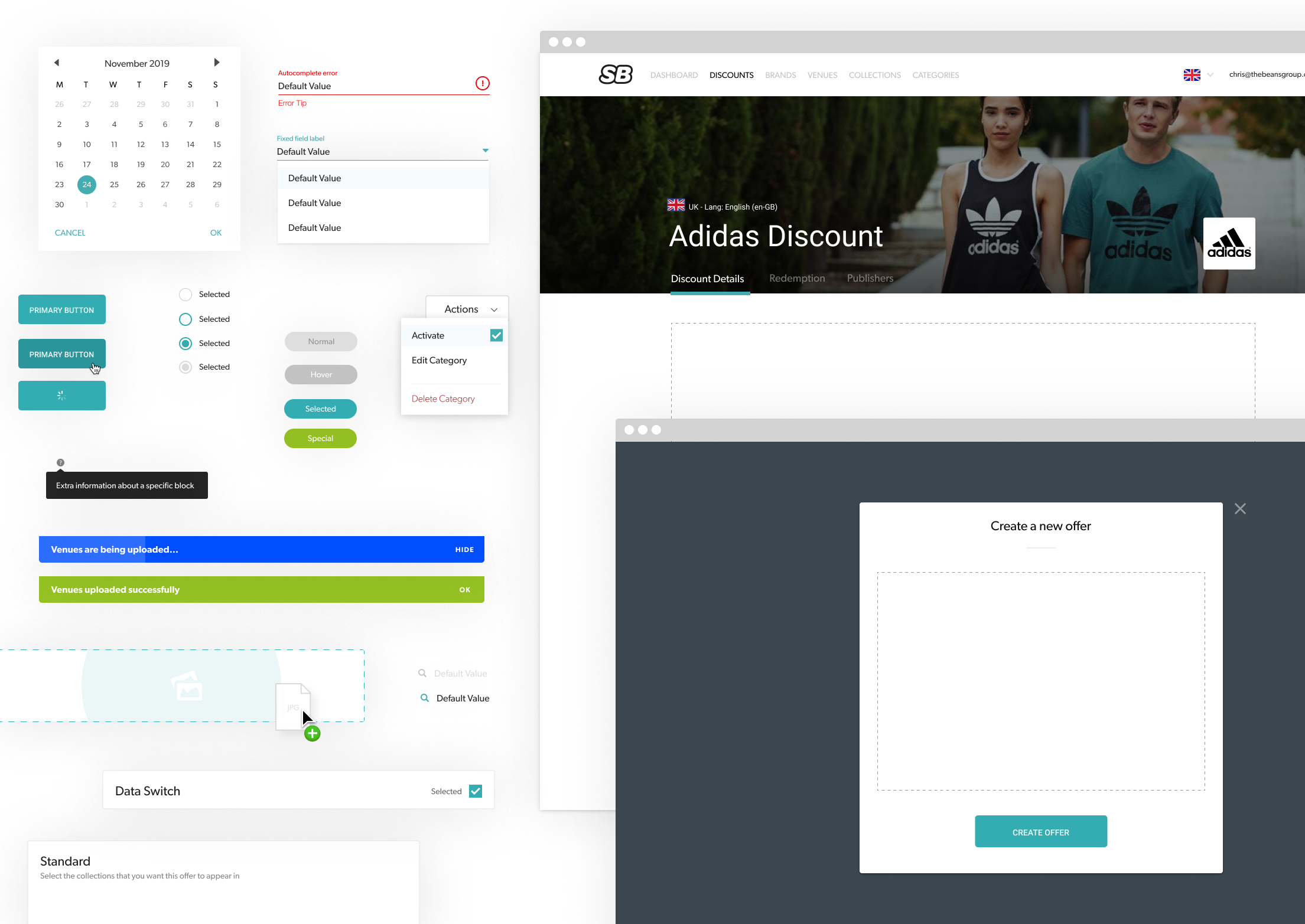
All of the form components are set up as symbols, consisting of nested symbols allows for all states to be accounted for from the single use. Although each state has its own symbol, each is made from a single form input which has a placeholder, hover, focus, value, error and disabled state. All of which can be altered on the fly.
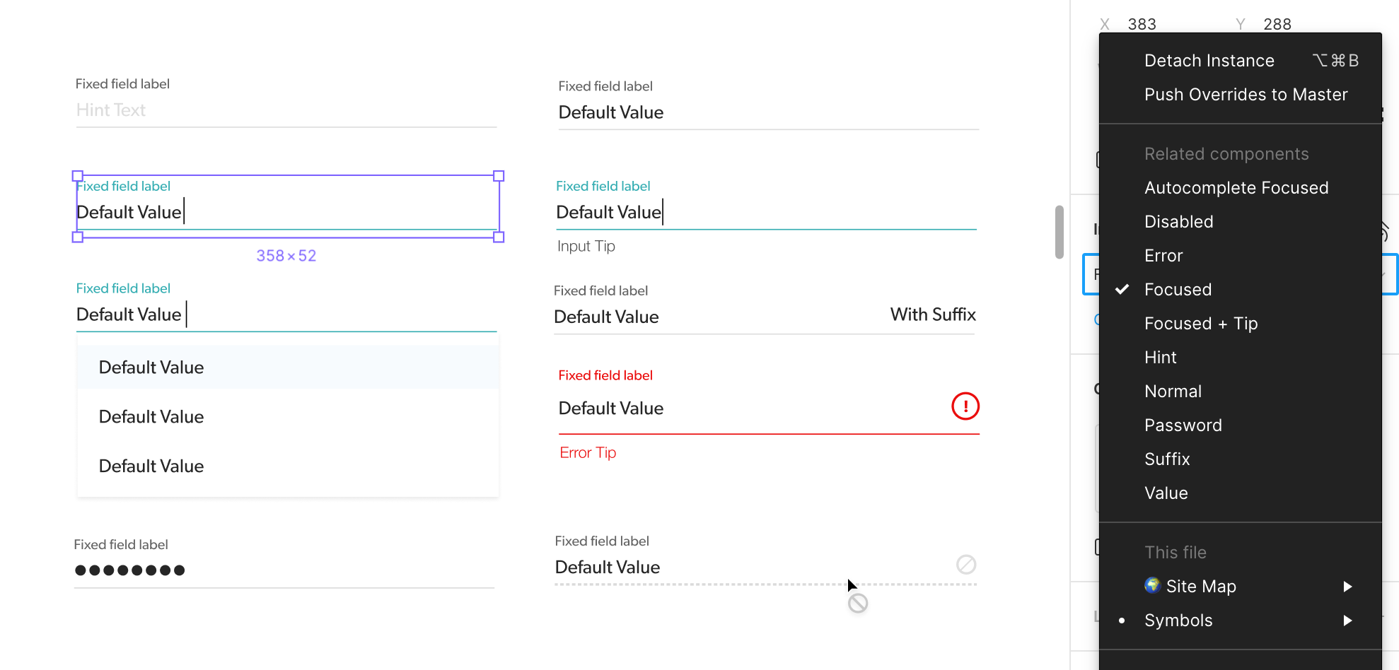
All of these field variants can be made from a single input symbol
Documentation
The documentation within the design system is to provide a mechanism to help designers and developers know how to properly use the common components and patterns of the design system.
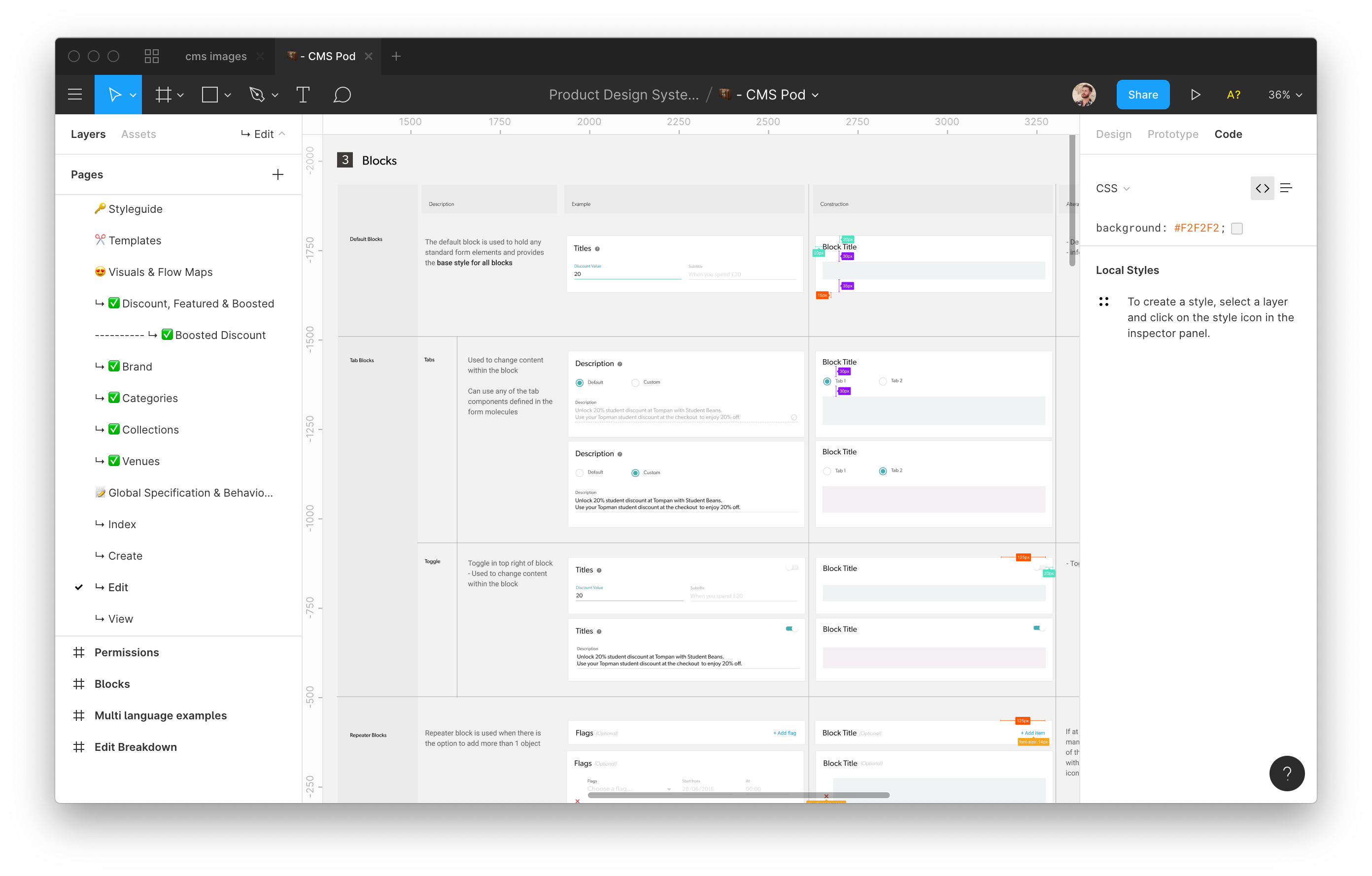
Above image shows a snippet of “Blocks” in my documentation. Explaining how they should be used and their specification.
Like any product we design and develop, a design system must address the needs of adopting product teams within the current landscape of culture, tools, existing systems, and practices. For us at this moment in time, it meant keeping the UI kit, templates and documentation in a master Figma file. Why take it out of the software we use everyday?
Naming conventions were defined in collaboration with engineering which was invaluable in making sure we were always in sync. The engineers developed the components defined in the Figma documentation into their own library using the exact same terminology.
How is the Design System used in practice?
As previously stated, the goal of the design system is to allow us to build new features faster, without sacrificing quality.
Once these core components and templates were in production, new design and development phases became ridiculously quick and simple.
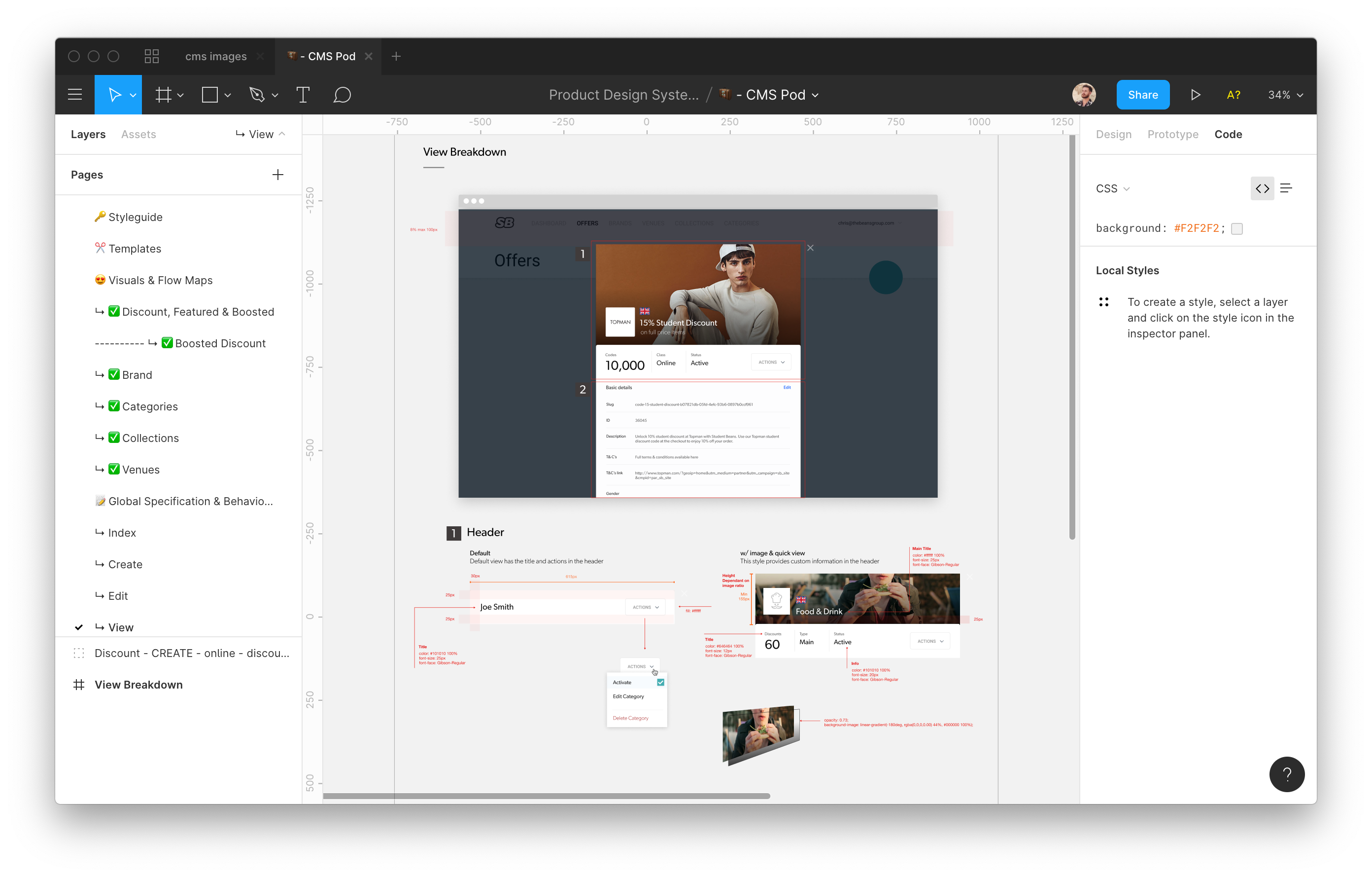
To document what needs to be added to the CMS, the designer can use a range of already existing components to solve a specific problem. 90% of the specification documentation is likely to be just written using the semantics agreed between Design and Engineering. With no need for new visuals!
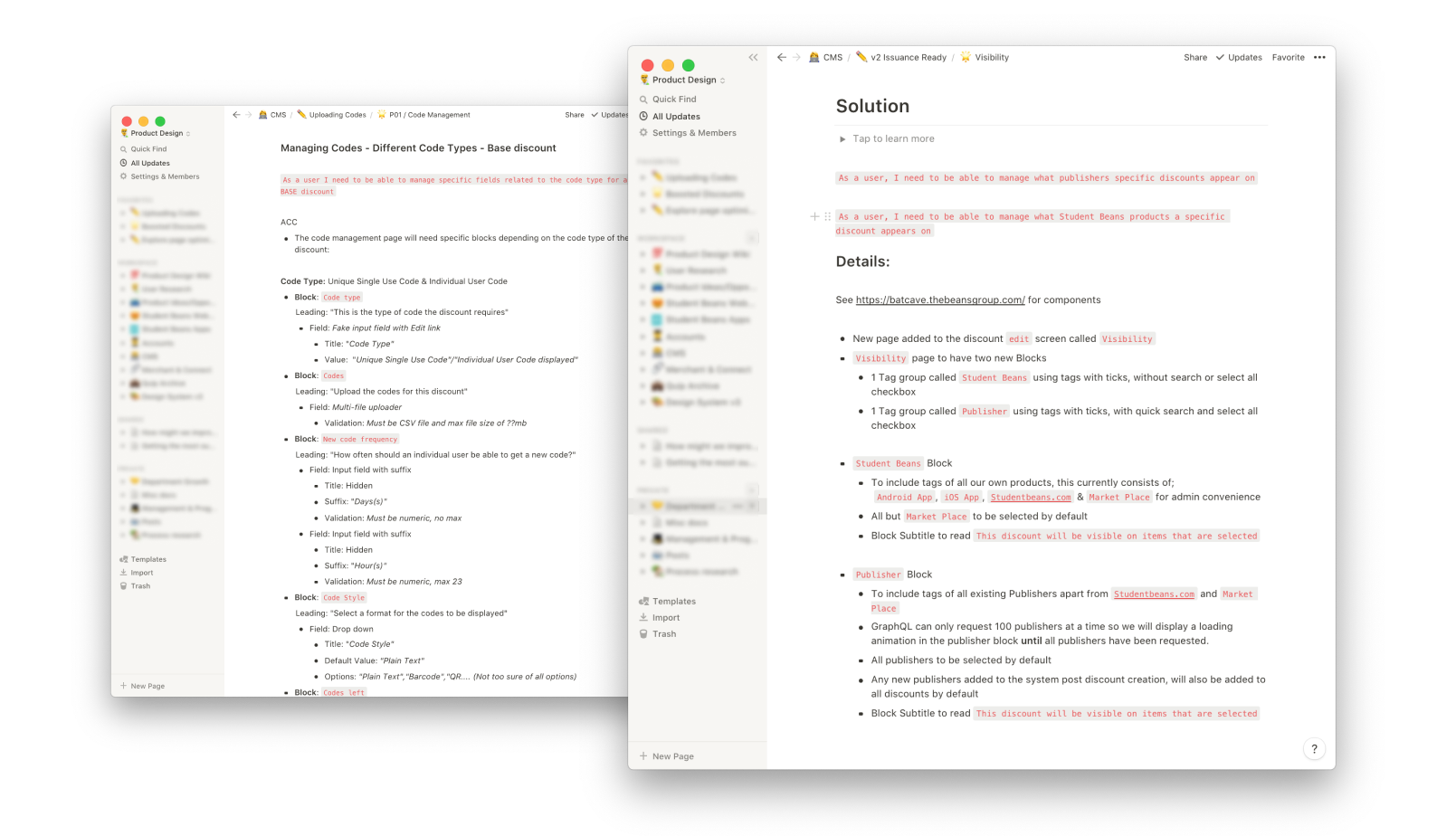
These are exmaples of Design Specification document that didn’t require any new UI design because of the components and shared semantics.
Obviously sometimes visuals need to accompany the words to give a clear picture, especially if it’s a new user flow. Thanks to the design system in Figma, the designer can create high fidelity visuals in next to no time.
Conculsion & Next Steps
Being a product designer goes beyond the end user, here we solved an internal business problem too and I don’t just mean for our Ops team. Design considered the velocity of the Designers and Engineers too.
The delivery of the CMS was a bit of a headache, however, throughout the 2 years it made us challange and restructure the way we scope and deliver software for the better of the whole organisation.
Since inception, the CMS now has its own full time dedicated team responsible for improving and stabilising it. It’s the heart, brain and digestive system of Student Beans, it’s health is detrimental to all the other products and it’s great to see it getting the attention it needs.