Building a marketable proof of concept
Gateway case study - An example of cross-functional teams working collaboratively at speed.
Company
Student Beans
Role
Lead Product Designer
This is by no means one of the sexiest project I've worked on at Student Beans, the surface presents a very simple UI with a lot of work going on behind the scenes. It is however a great example of how a cross functional team can collaborate in an agile way, debating and making trade-offs, to create a truly minimal viable product to test market fit.
The Opportunity
The business spotted an opportunity in off-site affiliate marketing. Allowing others to earn commission by promoting our discounts, the commission from the end vendor would be split between us and the site of origin. win-win. We were given the challenge of creating a commercial proof of concept. One that wouldn't be a huge cost to the business but would allow us to play in the field and iterate if successful.
The Solution
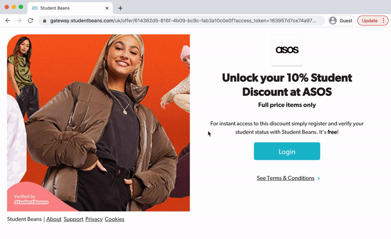
"Gateway" was born. Simply put - We provided a way for our partners to sync with our available discounts, allowing them to display them on their own website. For their visitors to redeem the discount code and also verify as a student, they would be directed to our hosted landing pages which housed the individual discounts.
Discovery
What needs to be done?
In a kick off session it became clear that this project would cross every product stream and require the knowledge of multiple domain experts. To make sure that everyone involved both understood the work involved and had a common understanding of the domain, a Storming session was led by our Technical Lead. This got multiple product teams, including wider business stakeholder sponsors, into one room. Storming sessions help realise what needs to happen and when, without specifying technology, but in the business domain of the things that have to happen.
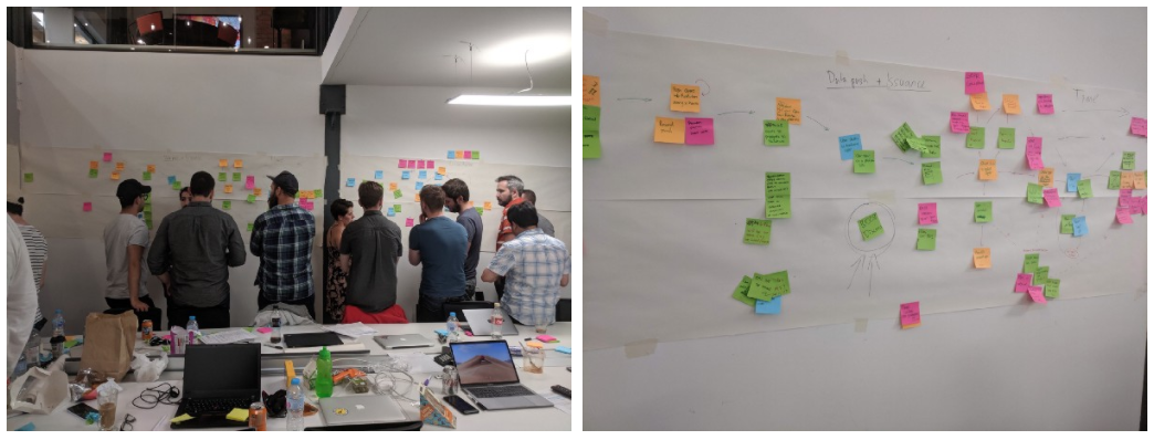
This painted a beautiful picture of all the events that would need to take place in order for "Gateway" to work. Four main themes appeared; Discount Creation, Data Push, Issuance & Reconciliation.
The areas that required Design attention were in the;
1. Creation how do the Ops team manage the discounts that we want to share with affiliate programs?
2. Issuance how does the user interact with the offer and redeem their code?
Data Push and Reconciliation involved systems which would push our data to our partners and also make sure that all parties received their share of the affiliate revenue. Neither of which required any UI - Our talented Engineers dealt with that.
Define
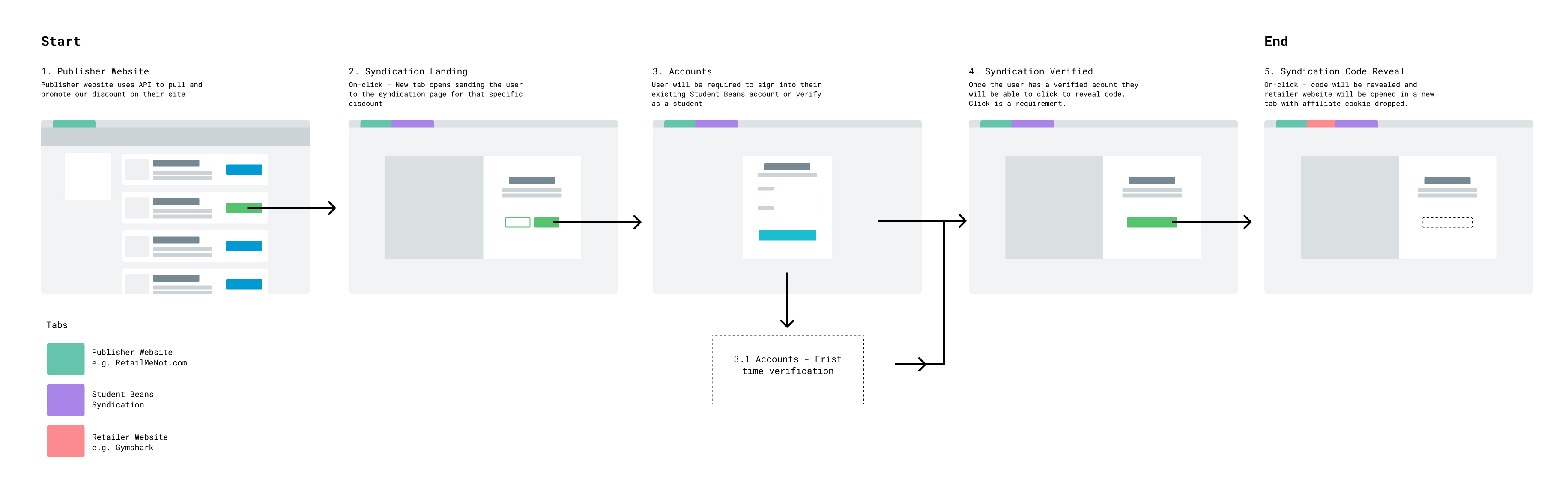
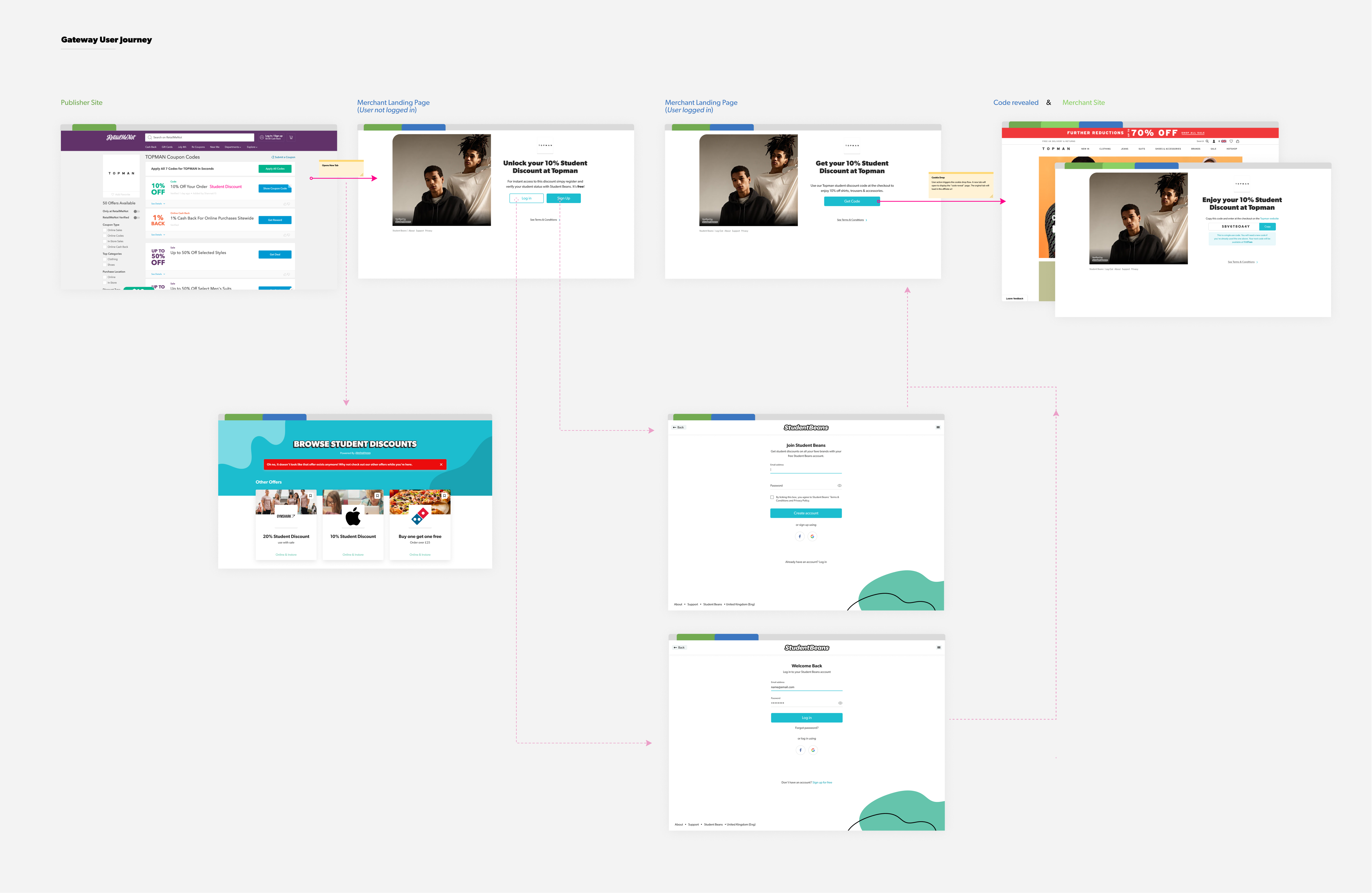
Issuance User Flow
I first worked to document the basic user flow of the consumer product we named "Syndication" - talking through the steps with the team to make sure we all shared the same user journey vision.
This gave me a high level reference of the design goal. How a user will come from an external partners website and end up redeeming a code.
Issuance Breadboard
Working within the Issuance domain, I grabbed an hour with our Lead Web Engineer and we listed out everything that needed to be considered from a UI perspective to meet the agreed MVP - screens, flows, states, errors & edge cases.
I took our whiteboard session away and created a digital breadboard. A breadboard is a step back from a wireframe, it doesn't show us how the pages should look but shows us what needs to be present on each page.
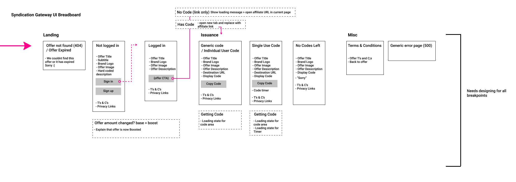
The breadboard highlighted to the team the work that would be involved to design and develop the front end of this product. It acted as a source of truth and became a way for us to have a shared vocabulary and vision. It also helped us realise the real scope of the front end of the product, visualising exactly what's included in the MVP.
Creation Requirements
Through the Domain session and detailing the customer needs through the breadboard, we uncovered that there were just a couple of additional pieces of data that would be needed to be handled in the existing Discount Management System to allow operations to manage the publishing of these discounts.
Whitelisting- How might we allow Ops to manage whether a discount is available to our 3rd party program?
Affiliation- How might we allow Ops to manage the affiliated URLs?
Design & Develop
Just-in-time-design
Using the breadboard as reference, the JS Engineer and myself created tickets in our delivery board which broke down the work that needed to be done into small independent deliverables.
As we were moving quickly, there were still lots of unknowns from a Backend systems perspective, so I made sure not to get too far ahead with designs. From a design perspective, I planned on delivering only what was needed (just-in-time-design), and nothing more, to increase the feedback loops between myself as the Designer, and both Back and Front End Engineers. Making sure we didn't waste time and have to revisit interactions if new information presented itself. Responding to new information over following a plan.
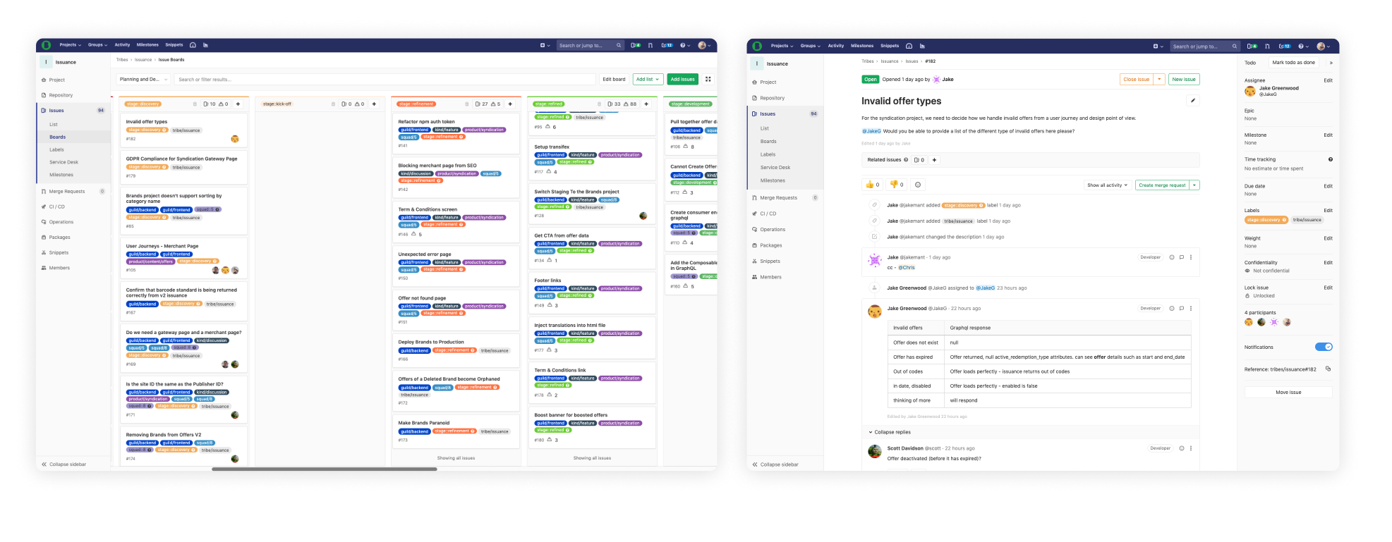
(left) Individual deliverables (right) Example of a deliverable that relied on backend spikes
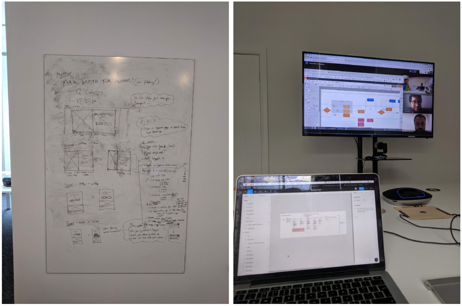
We made the decision to make sure we had the end-to-end journey working, rather than developing and completing a page at a time. This would then gave us a working, yet ugly, version of the final product. To cater for this, I first completed the design of a general templated "housing" that would work for every page in the flow - Providing the foundations of a responsive and fluid design direction.
Design Direction
Deciding on a design direction would have to take our current restraints in to consideration. Specifically our offer images. These are just 640×320 and designed to be presented in landscape orientation.
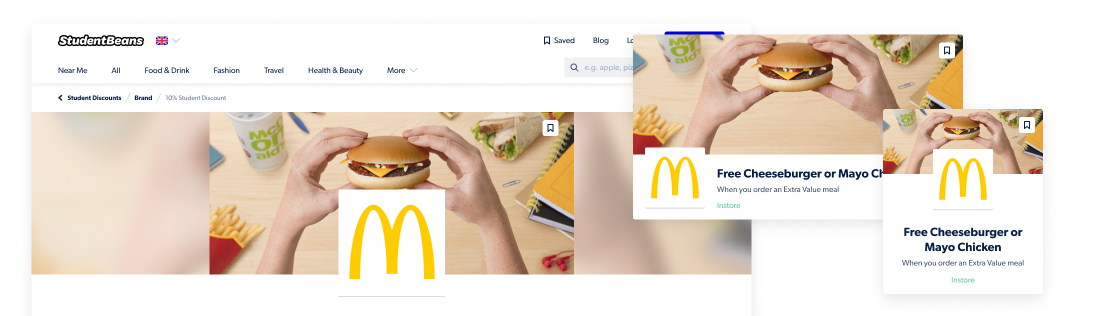
Existing Image constraints
The immediate response was to use them in the exact same way, keeping the image ratio the same and cascading the discount information below just like we do on our own offer pages. However, I quickly found this layout (as demonstrated below) pushes Offer descriptions and CTA's below the fold. As users would be coming from a different site, instant context is extremely important here. I wasn't comfortable having content and cta's so easily be pushed down. It would also mean that as a user progressed through the flow, they would have to keep scrolling down to get their code after the reveal.
I decided to extend the current image ratio to allow for better context above the fold - but risk having slightly pixelated images.
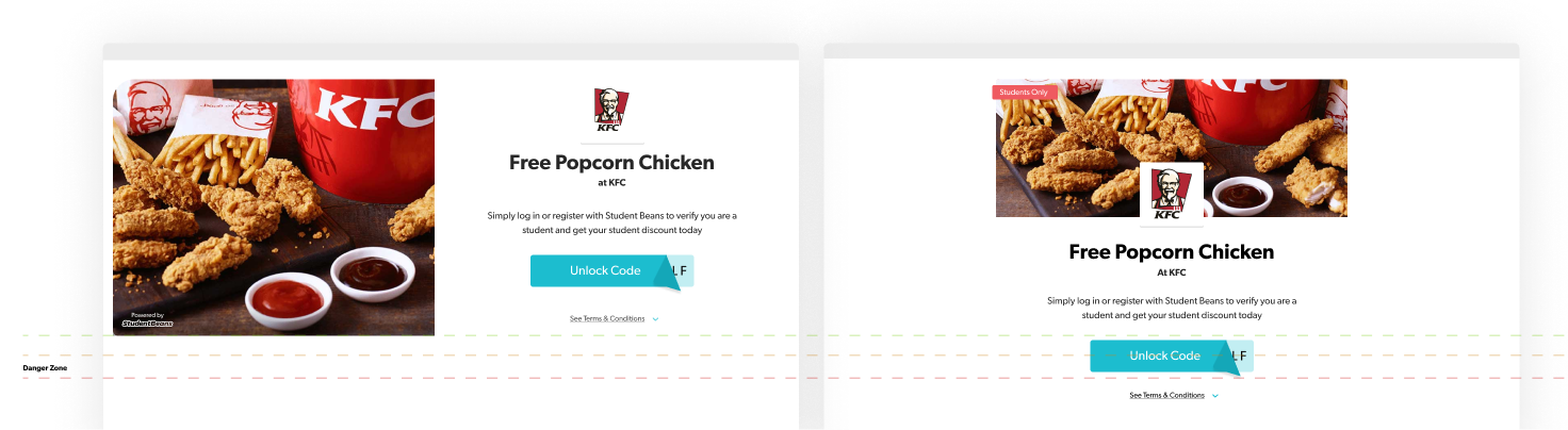
I argued that the instant context and usability was more important than image quality in the first instance, depending on the actual image degrading. To give a better idea of what sort of image pixelation we would be looking at, I asked our Frontender to pull down some examples at the new ratio so we could see how bad they may be and share with stakeholders.
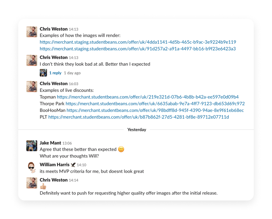
Quick chat with PM & Commercial Stakeholder
We were happy with the results and decided that we would revise the image quality issue in the iteration phase - which we did 🎉
This small image quality issue could have set the design direction of the whole project. I'm happy we were able to resolve it. With that decision, I finalised the specs for the basic page template.
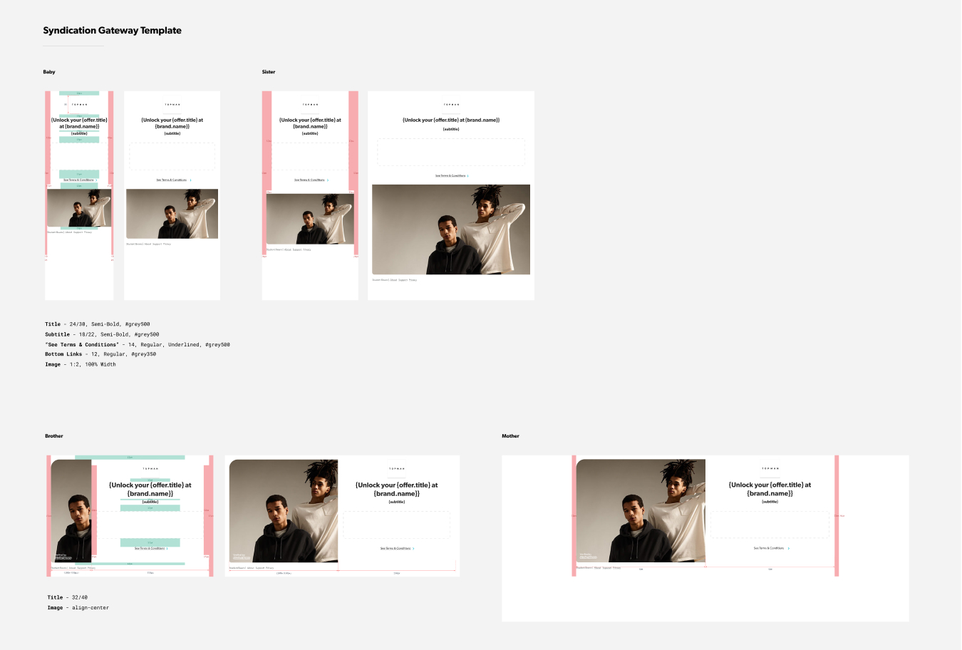
The basic specs for the page template
Refinement
With that, we progressed pretty quickly to having a complete end-to-end journey produced - although ugly.
To have a complete working version so early on was really empowering. Knowing that it works we could put all our efforts in refining the design for the user experience!
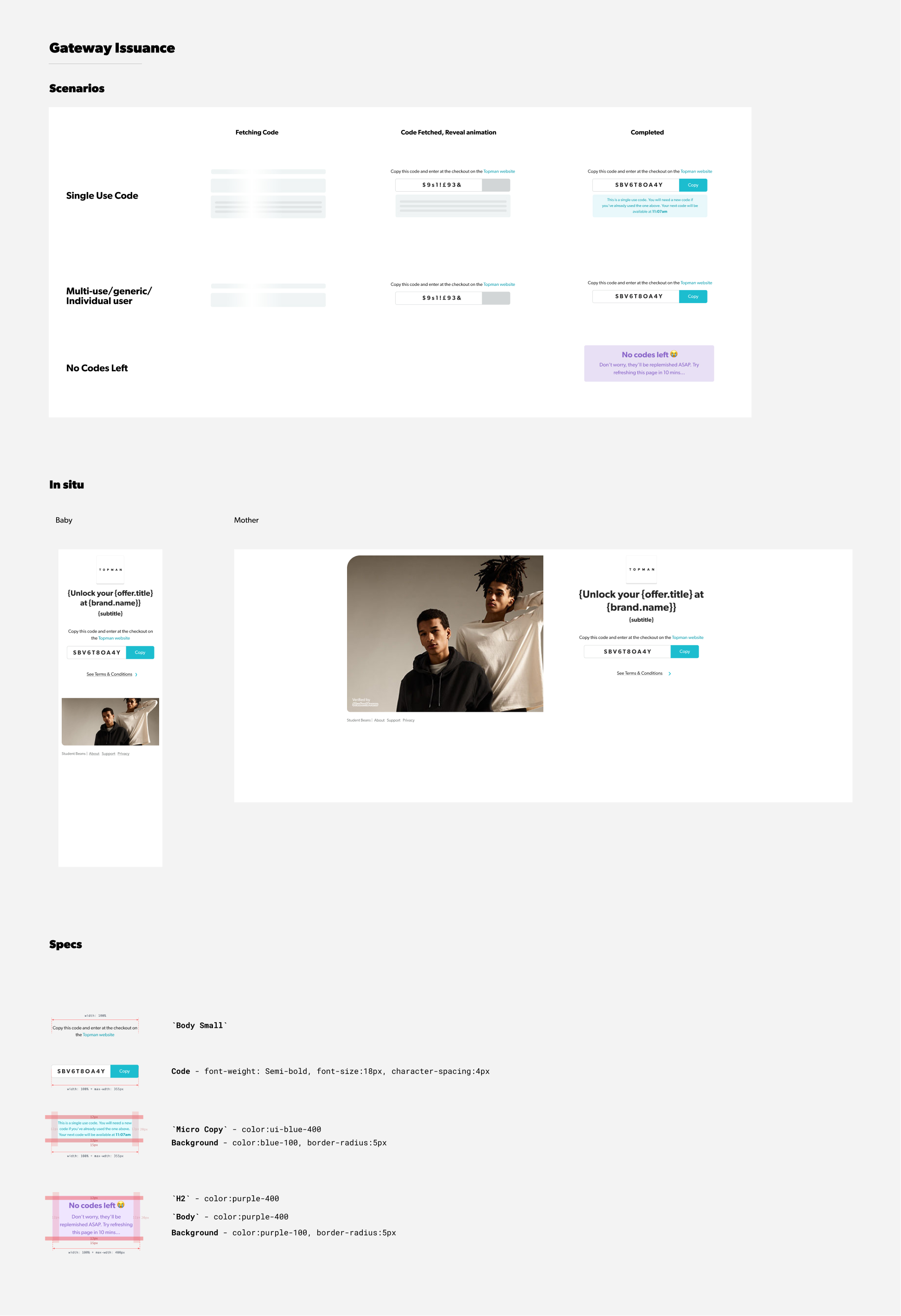
Working between editing in browser and polishing in Figma, I put the final specifications together for each page, interaction and error state.
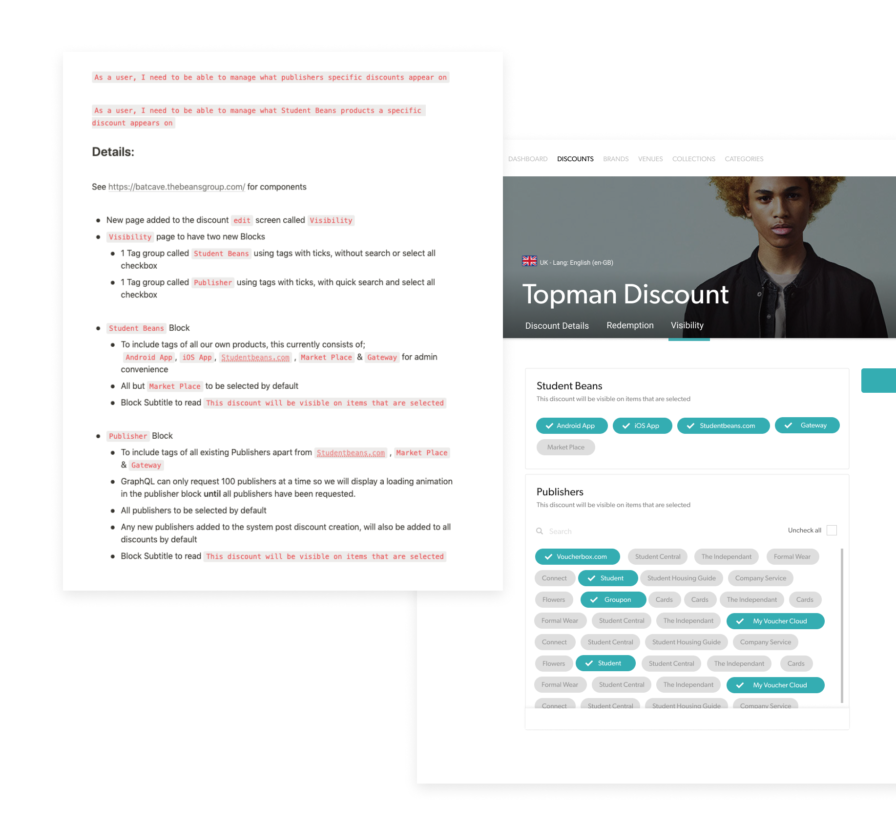
If you remember back to when we defined the Creation requirements, two new objects needed adding to the Content management system to allow our operations team to manage the tracking and visibiity of these Gateway pages.
This was an extremely easy task due to the well oiled CMS design system and didn't actually require any design work other than writing out the requirements. We also used this as an excuse to improve the visability selection for our other products. For the purpose of this case study, this is what that looked like in solving the "How might we allow Ops to manage whether a discount is available to our 3rd party program?" question from the define stage:
The Results
We managed to create a marketable proof of concept within the 2 month deadline. Which in itself is a success. The results in respect of the performance of the product in the market was so-so. It had slow traction and definitely did not have the impact the business were expecting.
That's ok though. The point in this initiative was to experiment. It made our initial investment back and we can now make calculated choices on whether we invest further in improving the features and functionality, or not.
Thanks for reading! 🙏