Putting Student Beans on the Map
The evolution of our In-store feature.
Company
Student Beans
Role
Lead Product Designer
What the hell is “In-store”?
Student Beans is a platform for Students to get discounts on purchases of goods or services. Research made it clear that there were always two distinct mindsets when it came to student shopping habits; Shopping online vs Shopping In-store. That distinction had to be clearly delineated in the app. To cater for this, we decided to split In-store discounts and Online discounts at our top level navigation.
Our In-store discount offering, at its basic level, provides the following:
- Educates users on what physical high-street stores, restaurants or entertainment places they can get a discount at.
- Provides physical stores with a way of attracting new customers, making students aware of their existence and an incentive to give them a try.
- Provides users with a digital Student Card (Student Beans iD) that they can use to prove their student status at any establishment, whether explicitly partnered with Student Beans or not.
I’m going to take you on a journey of how In-store has evolved over the year and a half and how we have taken an iterative approach to a feature that has our users at the heart of it.
Phase 1 — The MVP
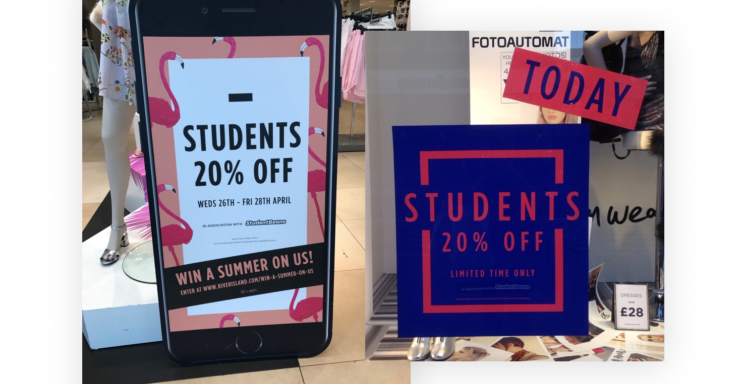
The launch of our app would correspond with an exclusive one day nationwide in-store student discount partnership with River Island. River Island turn over £900m in sales each year, and this would be the first time they offered a student discount. It would be announced to the public 4 days before the event.
This event brought our original launch date forward by 2 months! We needed to make sure we released the apps in time for the public announcement of the River Island discount and that it was stable!
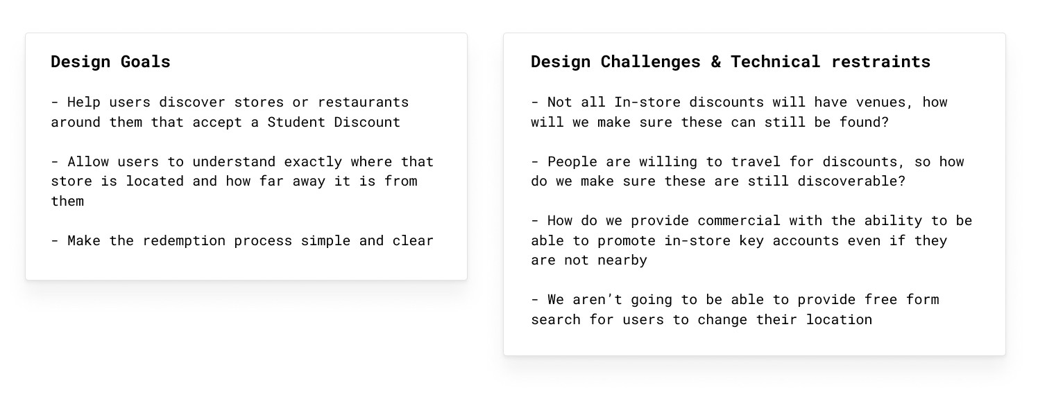
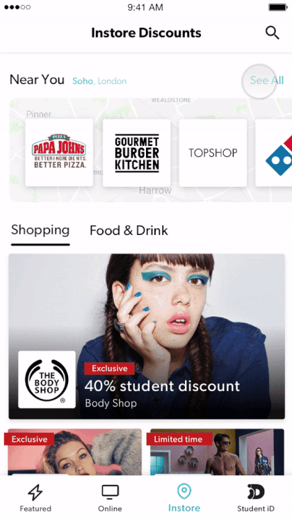
With a pressed time scale we made the decision to launch in-store as a replica of the Online page — A simple list of discounts organised by categories
An obvious first iteration that would give the user just enough information to know what the shop was and what the discount was. This also provided them with their Student Beans iD, which they would use in-store to prove their student status and get that discount.
But, hold up 😫...
Two weeks before launch day, we came to learn that we had a backend issue with our offer service and API that meant we were unlikely to be able to feed our in-store discounts to the Apps in time for the River Island launch.
So where do we go from here?
a. Postpone the launch of our apps and miss the River Island event. Or, b. Launch without the In-store screen
As you can imagine, option a wasn’t actually an option for us. We couldn’t sacrifice such a huge event to market and acquire users to our new App.
Ok, so if we’re launching without the list of In-store discounts — What impact will this have?
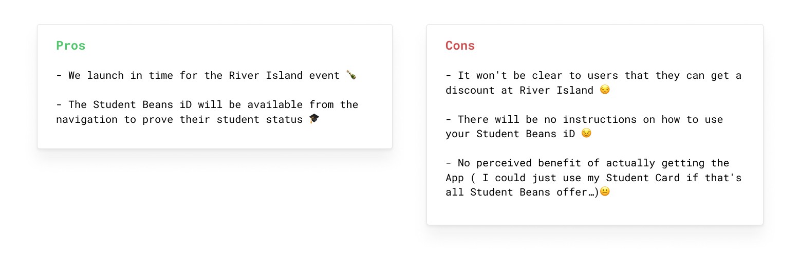
The cons bothered me and I was really concerned about the damage a poor initial user experience may cause us. I wasn’t comfortable with just launching without In-store, so I whipped the team together to discuss a plan c ...
Phase 1 Phase 0.5 — Fakin’ it till we make it
With a new plan, I wanted to address the following;
- Make sure that our early users can see the value they will get out of the app in the near future and that this isn’t just it — ie. In-store!
- Make sure that on the River Island day that users know exactly how to go about getting their in-store discount and have confidence in doing so
To tackle this, I explored the idea of keeping the In-store tab, but incorporating a dynamic image that would allow us to essentially fake the listing page when River Island went live.
The placeholder image plan:
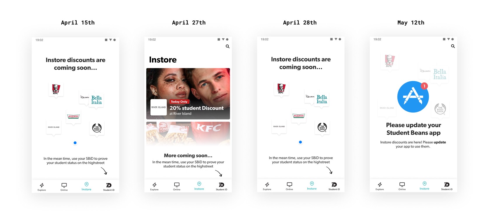
- 15th April — Launch Day: An image to show early adopter that something is coming soon and how they can get discounts in-store in the meantime.
- 27th April — River Island Event: An image on River Island day that clearly explains that there is a discount on offer at River Island for today only and how to get that offer.
- 28th April — Post Event: An image after the River Island event that tells them that they’ll be notified when to update
- 12th May — Update Prompt: An image that asks user to update to see the in-store listing
This was minimal work, all I had to do was create these images, export them for each resolution needed for both iOS & Android and uploaded them to the CMS at the right times.
The Results
River Island day promotion was a huge for us.
Using the Student Beans app to get an in-store discount, we turned over half a million in sales 💰 and acquired ourselves 22k app downloads 😵
We were able to launch the originally designed phase 1 of the In-store page two sprints after the event.
What could In-store become?
Phase 1 provided just enough value to make it useful, however there were many shortcomings.
To name a few received from customer and client feedback:
- Not able to filter based on location or discounts nearby
- Nationwide brands are prioritised over local retailers
- Not being sure if the discount is accepted at every one of its store locations
- Bias towards London based shops and restaurants
- Have to rely on own knowledge or google maps to know where your nearest retailer is
- Not providing much value for small chains or hyper local stores as users don’t recognise them or where they would be located
I decided to run a discovery session to try and surface the potential that In-store had to provide real value to our users and clients. To kick start my design thinking into the future of In-Store, I took to the whiteboard, brainstorming and asking— How could the app assist in the in-store shopping journey?
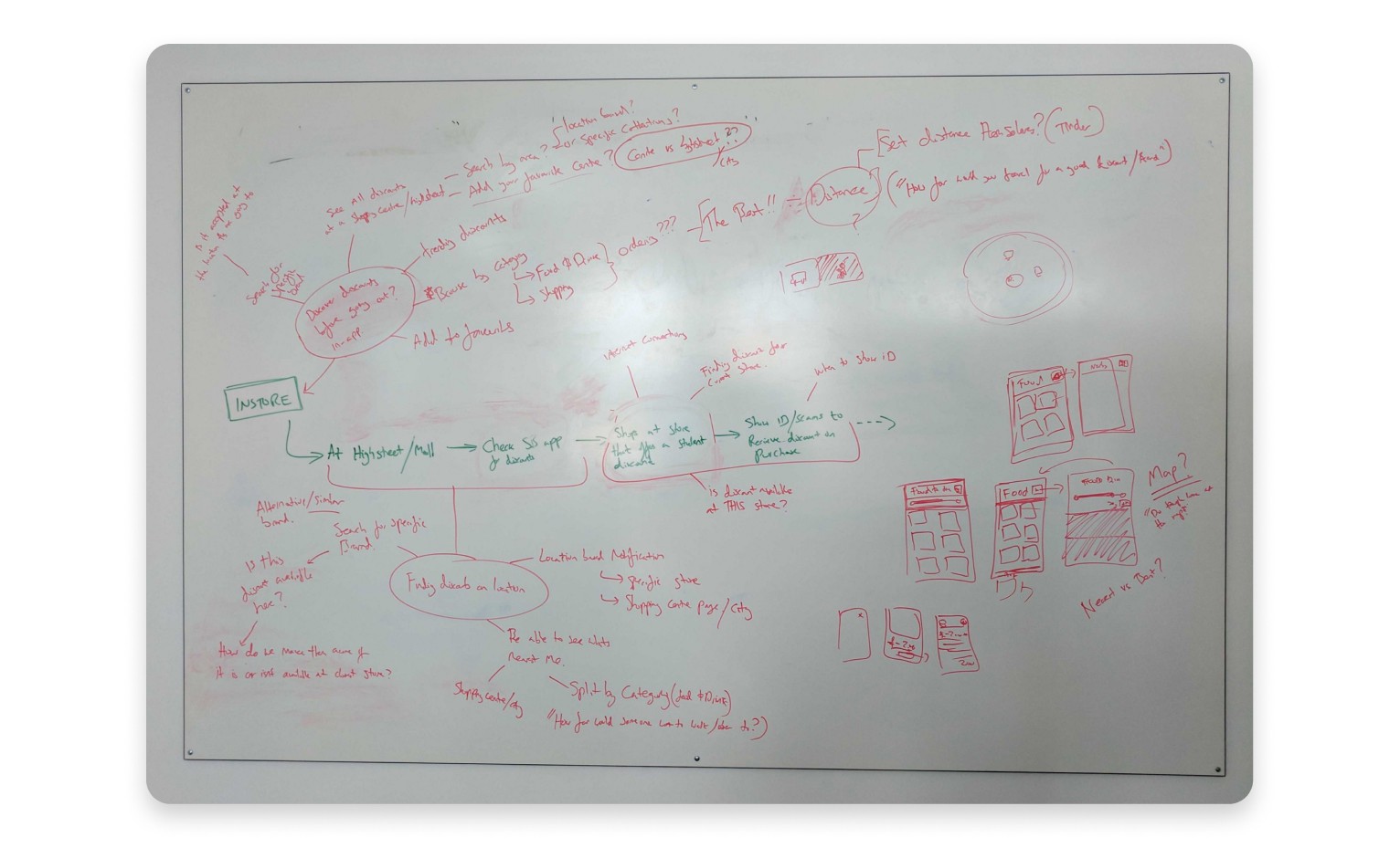
Exploring these key stages in the discovery and purchasing journey helped me to imagine what the app could become, where the opportunities are to provide real and added value for our users. The ideas surfaced here helped us plan and prioritise a direction to take.
Phase 2— Improving Confidence
For our next phase we decided to focus on one of the major pain points that came to light out of our user research;
Redemption Fear 😨 — Anxiety around asking if a store accepts a discount, or knowing when/how to present their voucher code.
Unlike many other voucher sites, all our discounts are with retailers and restaurants that we explicitly partner with. We know that our discounts will be accepted at the venues we say they will, but this doesn’t mean our users have the same confidence.
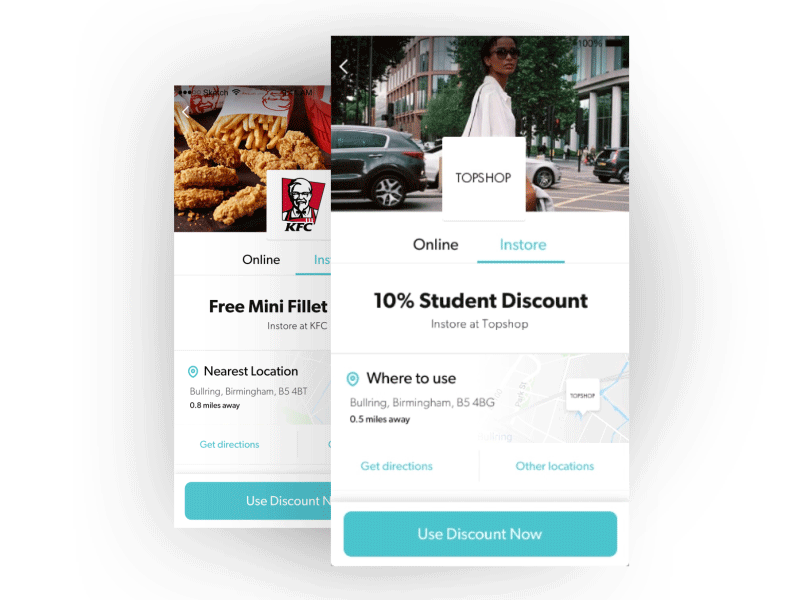
What stores accept this discount?
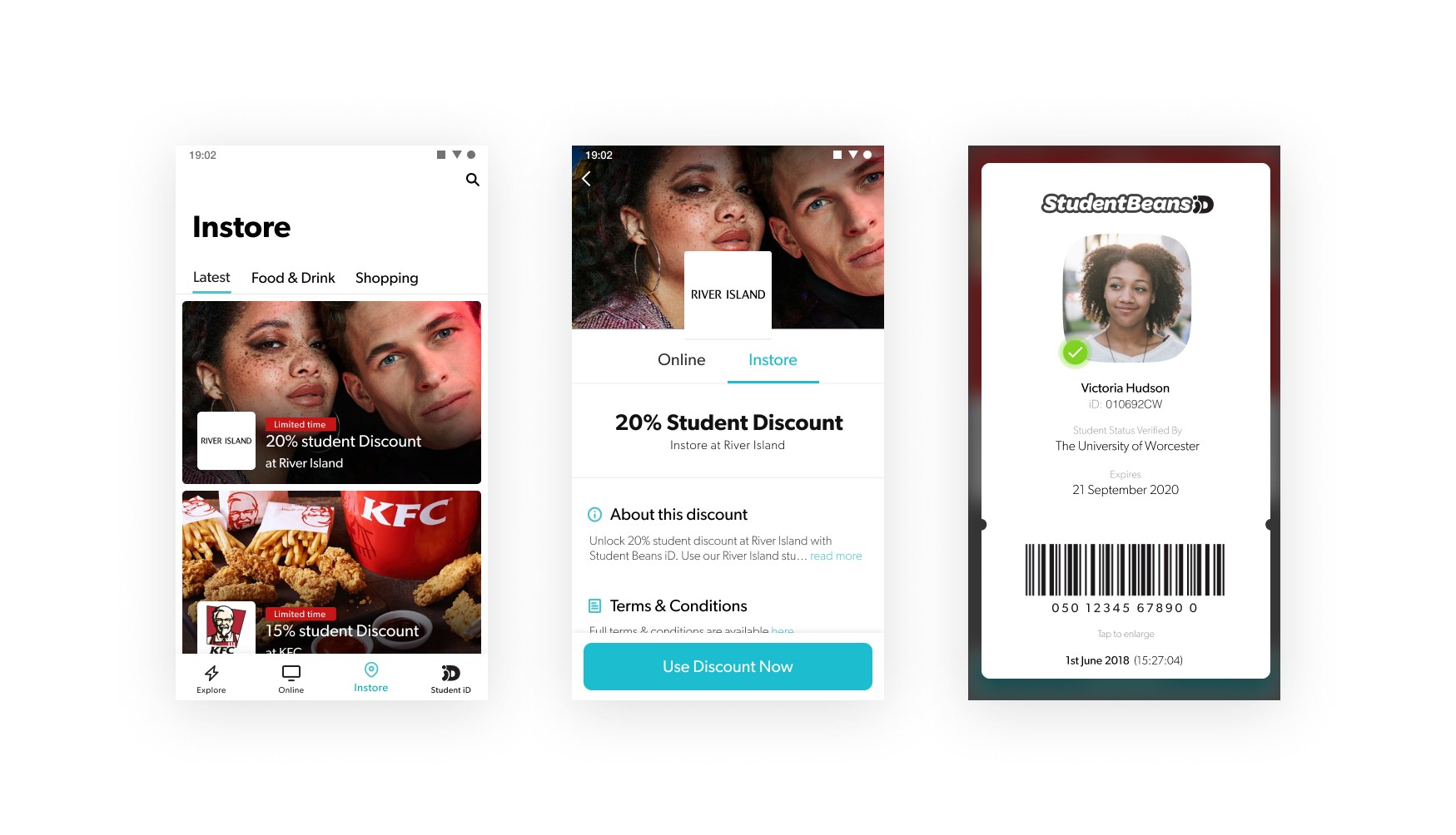
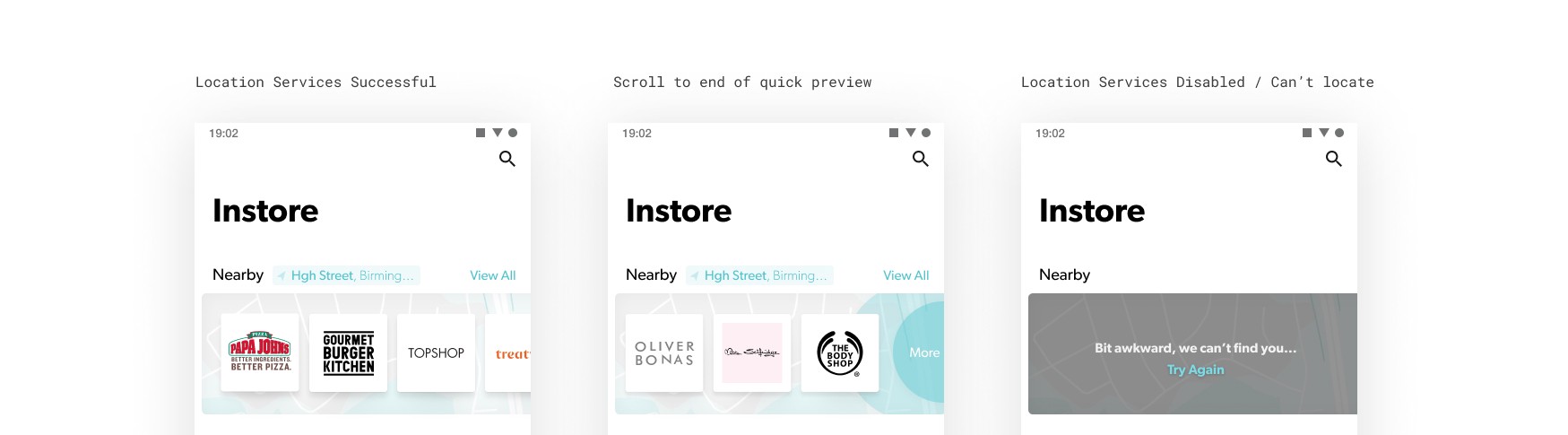
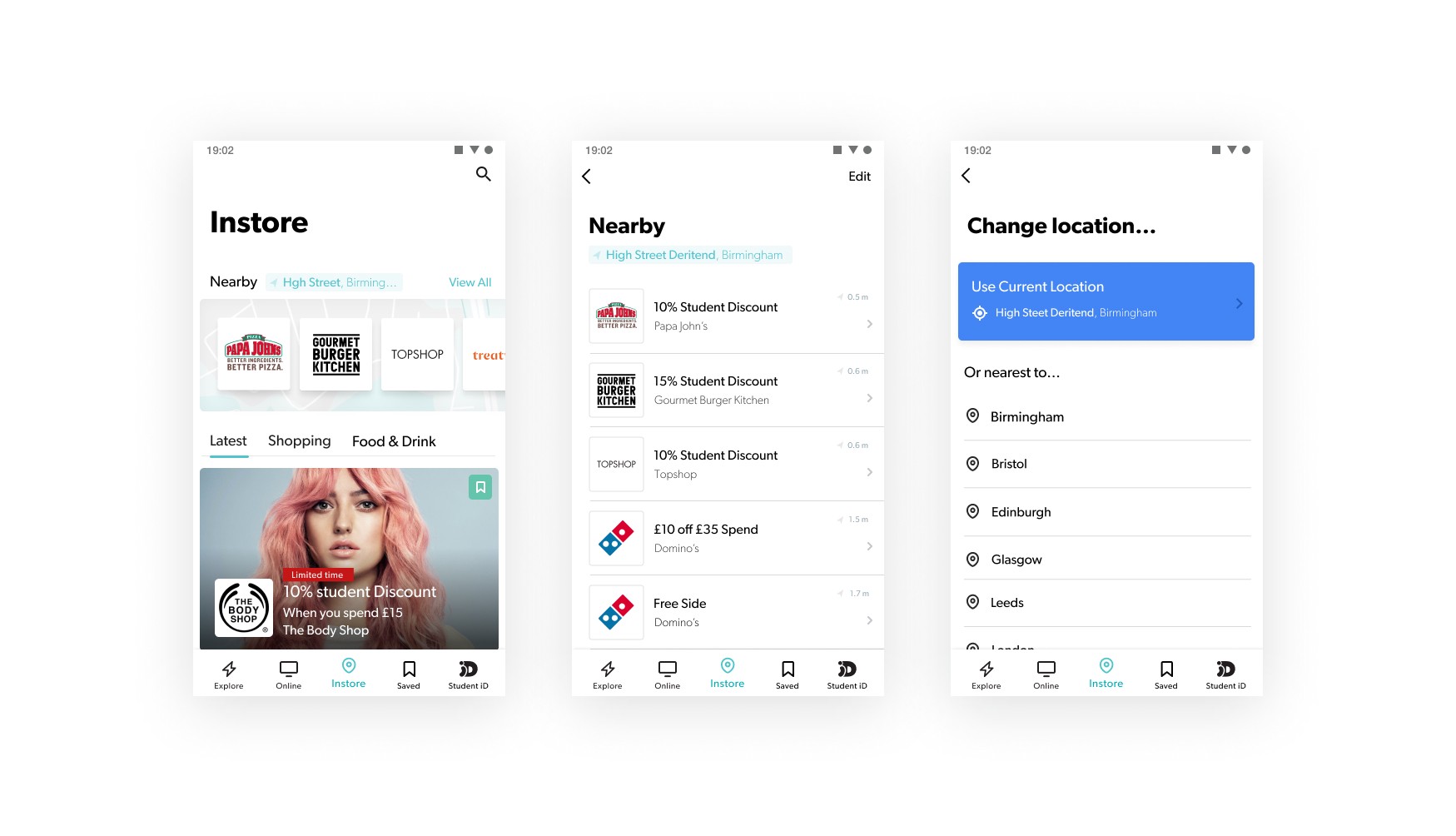
The natural progression for In-Store was for discounts to be location aware. This first step towards this was to start collecting venue location information and provide this to users on offer pages.
The feature allows the user to see exactly where their nearest participating store is, as well as being able to check any other venue in the country. Even if they haven’t shared their location.
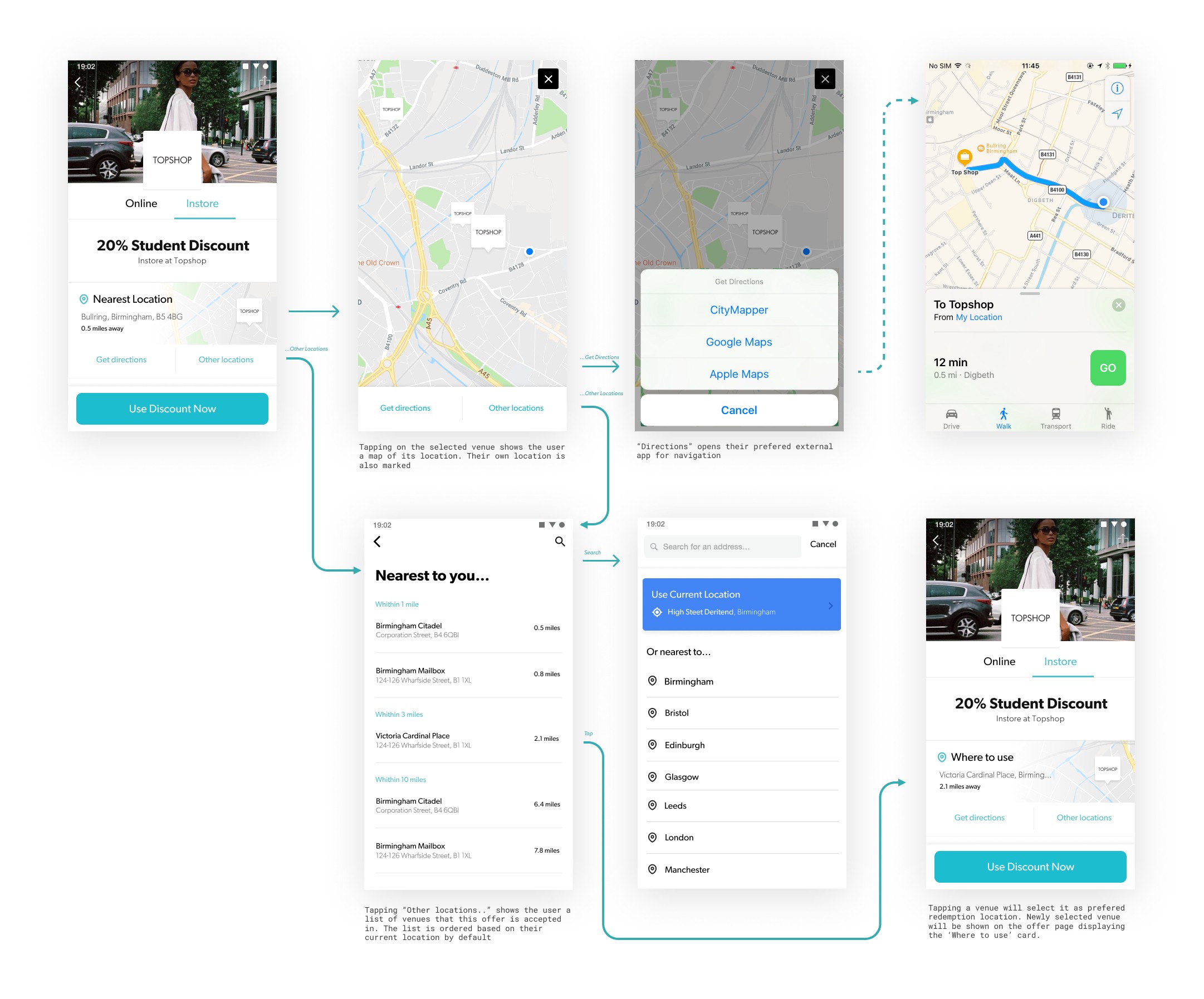
When do I show them my voucher code?
Do I show them the code before they total my basket or after? Do I tell them I have a discount before I order?
We’ve refined our offer pages to be as simple and to the point as possible, giving clear instructions to what the offer is and how to redeem it. Leaving little room for confusion.
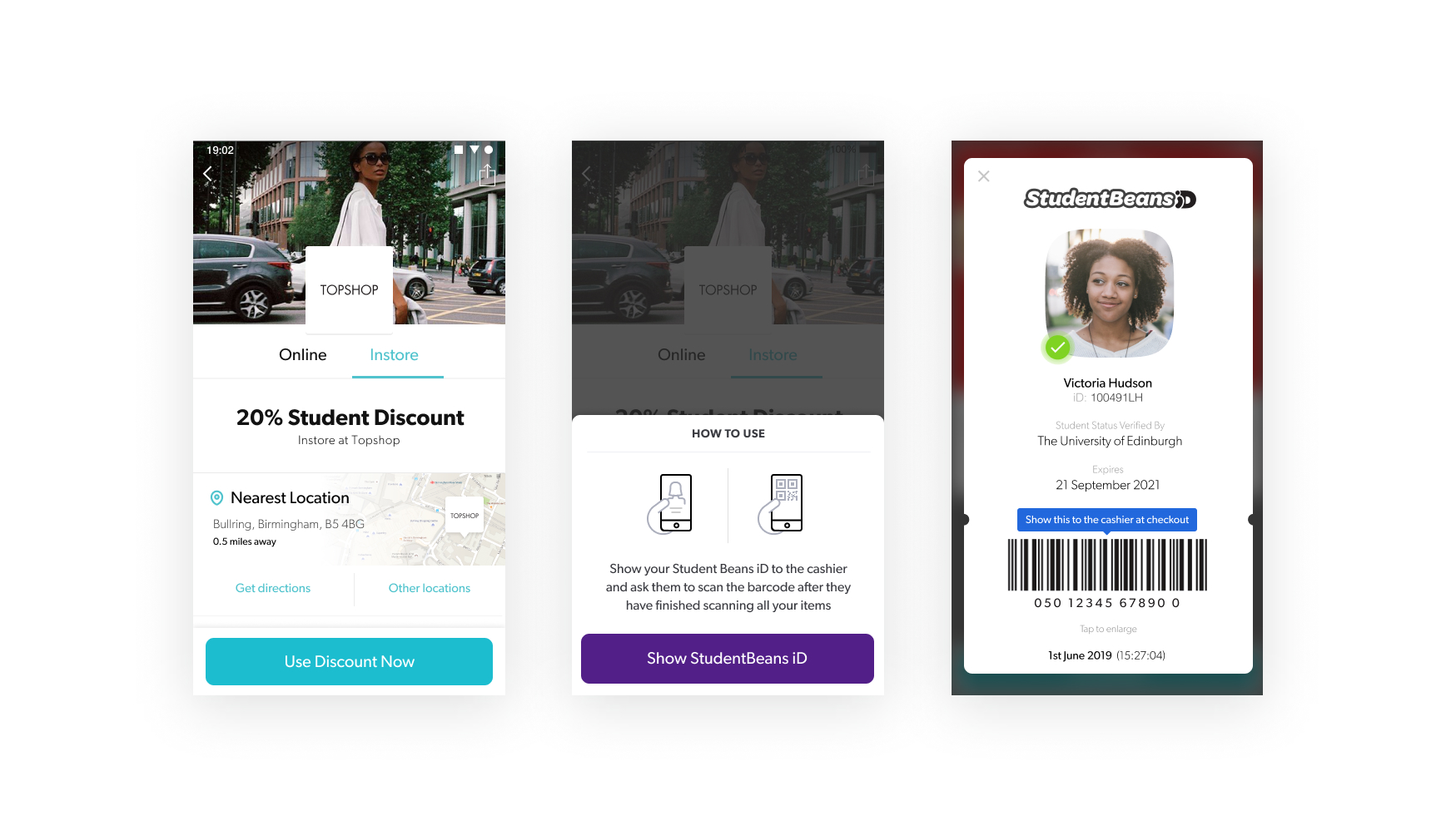
Do I have the right code for this store?
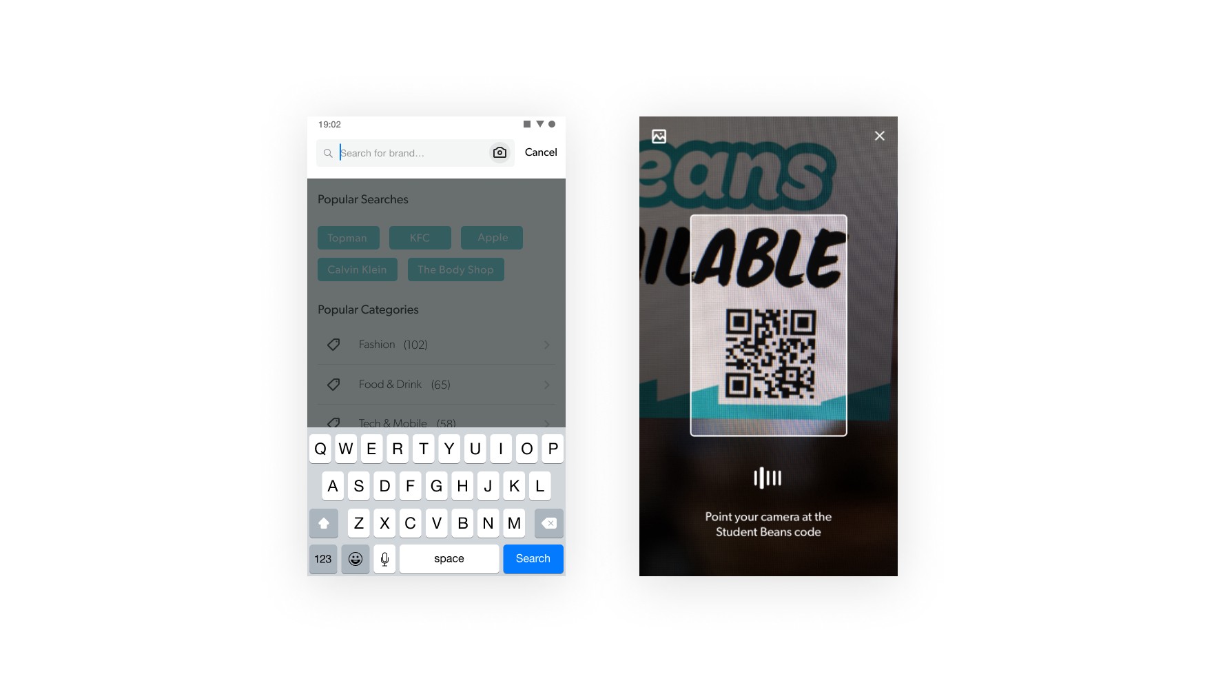
With thanks to our account management and marketing team, we were also able to get physical assets to the participating stores which left no doubt in users minds that the discount would be accepted. The window stickers, strut cards and flyers also included a Student Beans QR code. This code can be scanned from within the search pages of the Student Beans app, providing a fast and convenient way for existing users to get the discount for that particular store.
The Results
- 84% of customer confidence scores increased from good to great. - In-store offer use increased by ~25% - In-store related support messages & complaints decreased by ~70% - Customer frustrations caused by cashiers not accepting iD's were rightly redirected towards the shop rather than us.
Phase 3— Are any of these discount actually near me?
This next step towards making discounts location aware was to provide a way for users to see discounts based on their current or future location.
While brainstorming how discounts could be surfaced based on users location, the following themes & questions popped up:
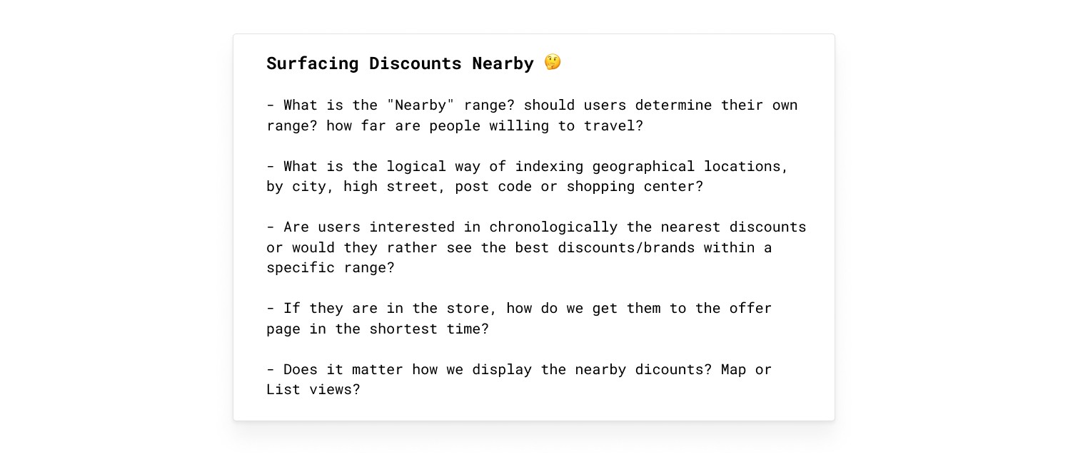
To try and answer some of these queries, I sent a questionnaire to a small selection of our demographic; those who shop frequently in-store and use discount apps for that activity. This was an attempt to benchmark and understand what these users expect from this type of feature.
We kept having an internal debate on whether launching with just a list of nearby offers as apposed to a map would be valuable enough as the first iteration of the feature we named creatively “Nearby”. It would unquestionably be quicker to develop, but I wanted to make sure it actually provided value. The questionnaire provided us with that green light.
Designing “Nearby”
With the commercial & technical restraints, I decided that the best approach in this first instance would be to treat “Nearby” as an addition to “In-store” rather than replacing it.
“In-store” would be for the window shoppers that aren’t particularly interested in just what’s near them at the time, and “Nearby” would have a clear cta for those that were already out and about or wanted to filter by a specific location.
I also pushed to allow users to at least change to a popular city if their current location was incorrect, or they preferred not to share, due to the large amount of interest in viewing discounts in a different city seen in the survey.
The above prototype was put in front of a selection of users in the London office to watch how they interacted with it. A few notes from the observation;
- User tried to click on location name to edit it. We should allow address to be editable from here
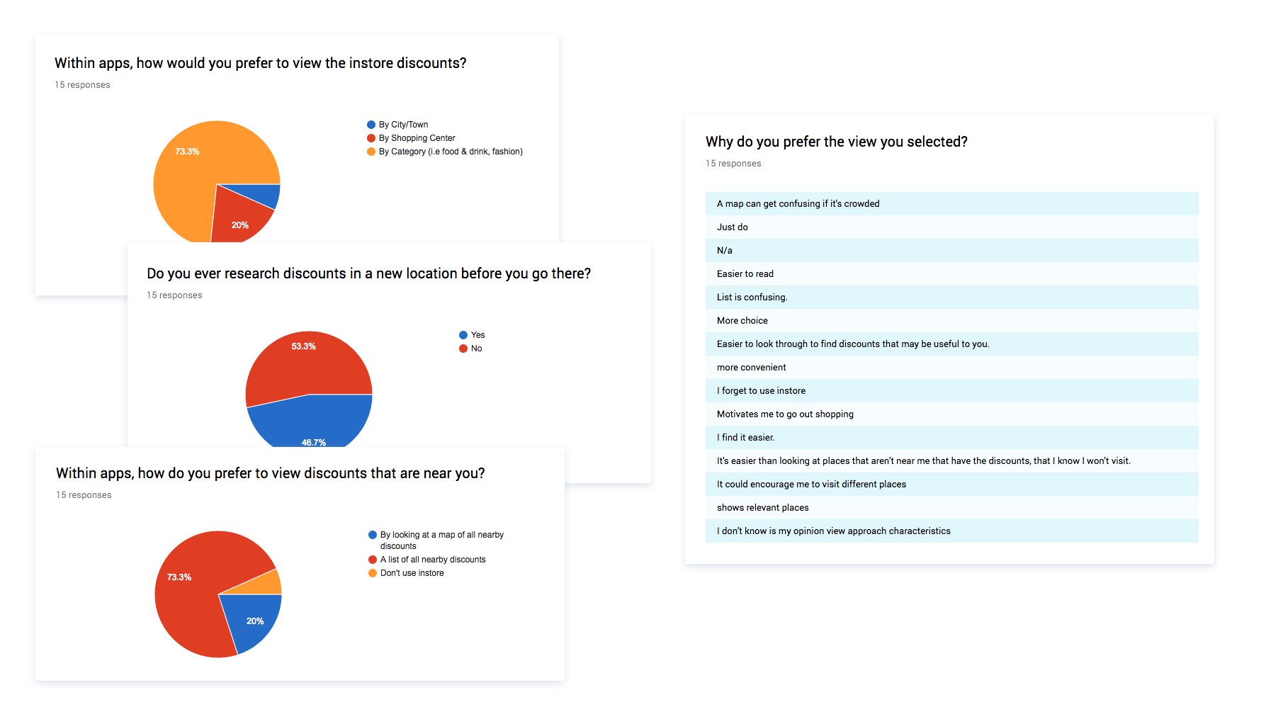
- Nearby was the preferred name over Near you, seeing as you could change the location
- A compact list view was preferred rather than a list of large cards
- User tried to search for a discount within the Nearby page thinking it searched for just those nearby — got excited then disappointed, so search should be removed form this level
After collating feedback from the testing session, a number of alterations were made to the UI and user flow before completing the specs
The Results
- Smaller brand redemption increased by ~40% - In-store category usage decreased by ~10% - Nearby conversion rate averaged out at ~20% - Existing users were very excited about the new feature (expressed in app reviews and interviews)
Phase 4 — The Map
The list view proved to be an ideal MVP of displaying nearby discounts, it was cheap, provided some value and gave us a starting point. After a few months we revisited the Nearby feature to see if improvements could be made.
I decided to create a small internal diary study to collect quick and cheap feedback on how users (albeit employees) were using the nearby feature. I’d arranged for genuine user interviews later in the month, so this activity provided a base for questions and to see if real users had any of the same pain points.
These are some of the issues that were arising with the list view from the diary and user interviews:
- Users thought that that items in the list would be right next to each other physically, but they’re not. Two discounts that are 0.5 miles away from my current location, one could be 0.5 miles west the other 0.5 miles east which is frustrating
- When their current location has little or no venues within 60 miles, the feature becomes completely redundant as you can’t extend the radius.
- To see how to get to a store the user doesn’t already know the process is a little long winded and unclear
In order to increase in-store redemption numbers we want to make the in-store discount discovery more visual and simpler to use. Providing the users with discounts located on a map was a next logical step however, a map isn’t short of its own issues
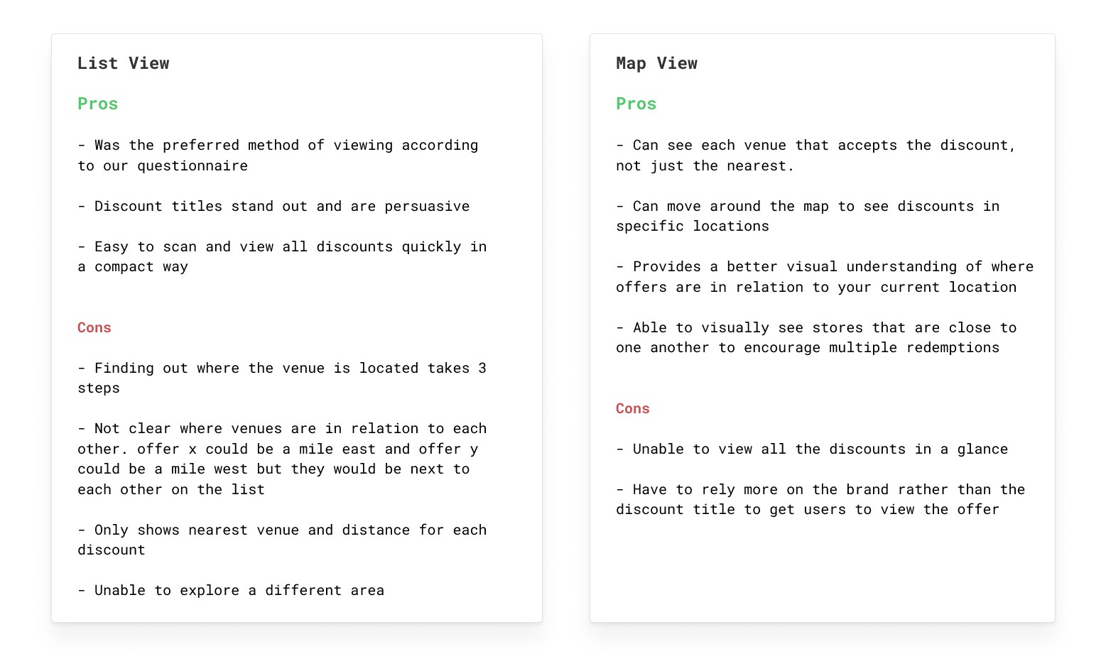
Giving users the choice to view discounts on a map in addition to the existing listing screen will allow users to choose the best experience for themselves at that time. There are pros and cons to each view type but having the two options for the user to chose from eliminates the cons from both.
Ideation
Initially, I took some time to explore an idea i’d had a while back of a combined map and list view:
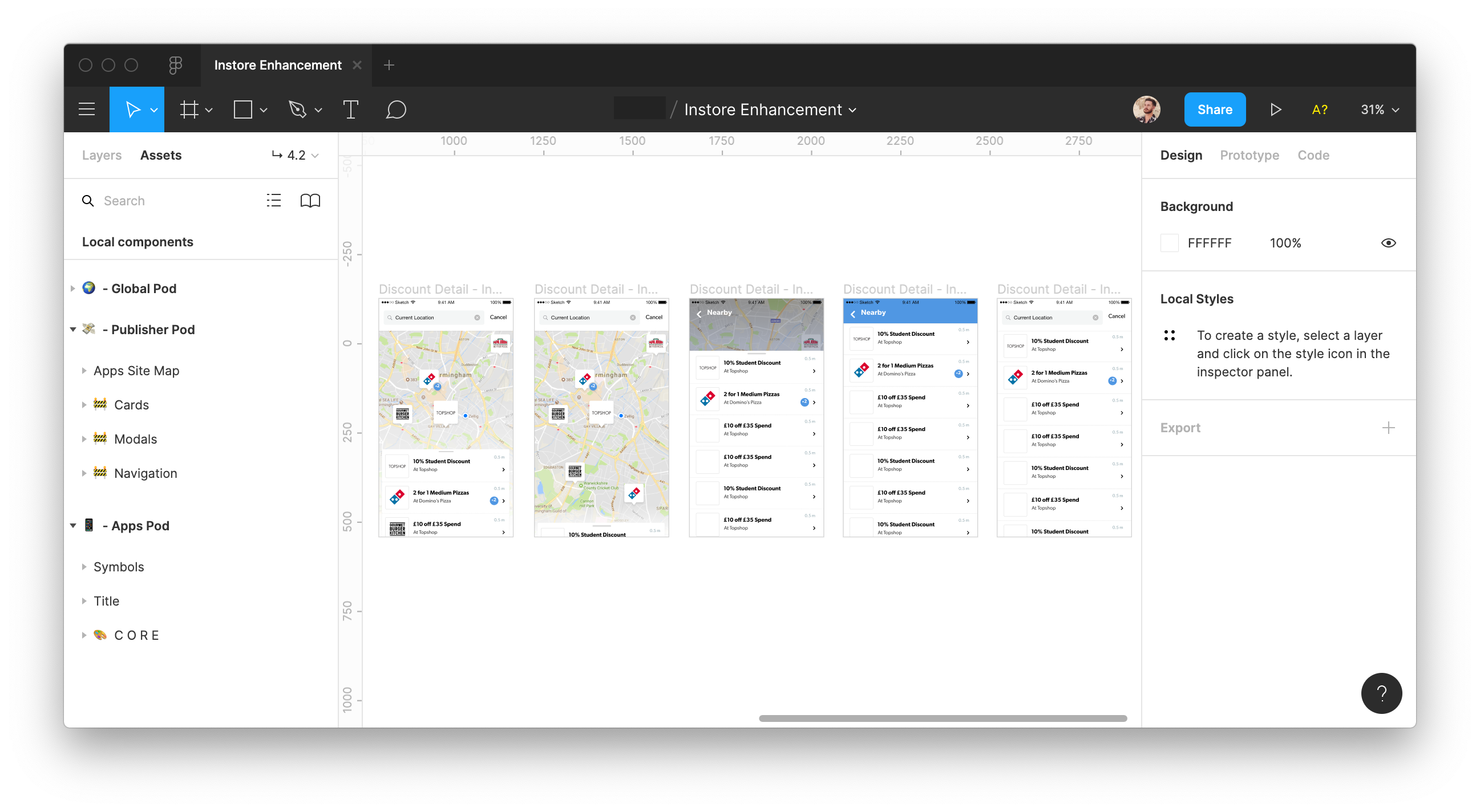
After exploring the interactions of something like this I had doubts that it would be the best direction to take, at least initially. It provides part of a solution but it just wasn’t eliminating all of the cons raised previously. The two sections (map and list) would have to work independently in every instance so there was there much point in having them in one screen, was it causing unnecessary confusion just to save one tap?
There were a lot of problems to iron out in that idea, although I was keen to do so a pressed time scale didn’t allow it. We decided it would be best to go for a more conventional solution and revisit this idea post initial map release
.jpeg)
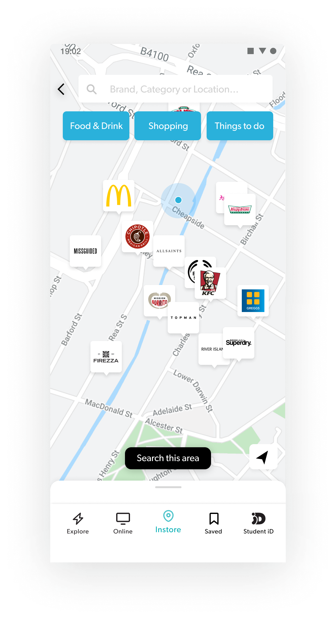
Having a separate map and list view seemed to be a safe bet but it was still far from simple. Focusing on the interactions of using the map it threw plenty of specific use cases to consider, such as;
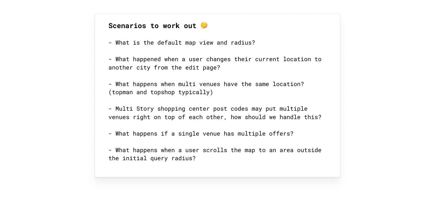
There were still alot of specifc interactions to work through. However, I wasn’t the first to be looking at adding a map to an app. I decided to see how other apps were already tackling the issues above.
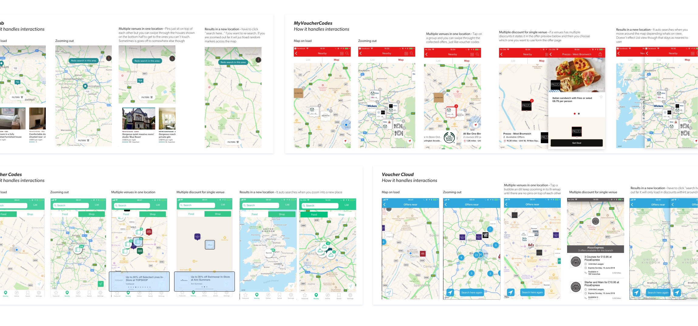
Benchmarking is an invaluable step in the design process, it allows us to evaluate the current user experience/expectations and find where those areas can be improved for us to provide an even better experience.
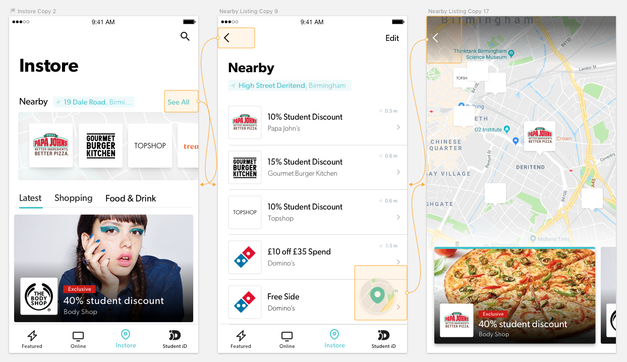
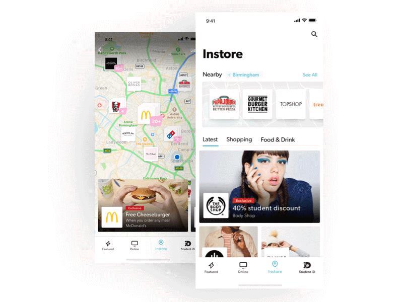
What we launched
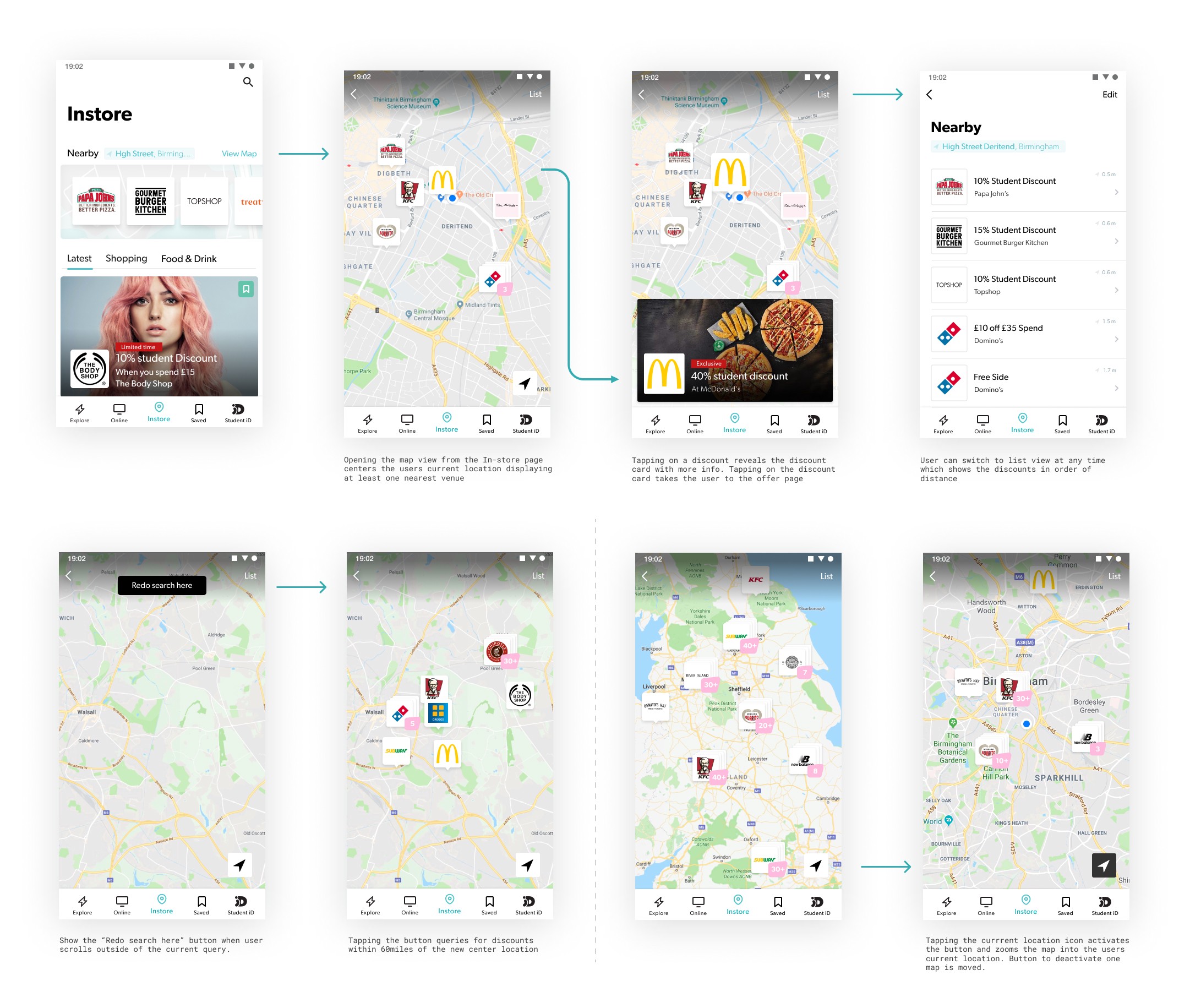
The Results
- Smaller brand redemption increased by ~15% - In-store category usage decreased by ~5% - Nearby map conversion rate averaged out at ~30% - 73% of in-store users rated their experience as excellent or good
What's Next?
We’re going to continue iterating on the In-store offering. If we have no more low hanging fruit we will pull it all apart and see what needs to be done to take it to its next peak.
I’m eager to explore the idea of bringing the map to the forefront of In-store, creating a more powerful search that’s dedicated to nearby and work on getting users thinking about us every time they are out on the high-street. Watch this space.